 Diamonds
| Hearts
| Clubs
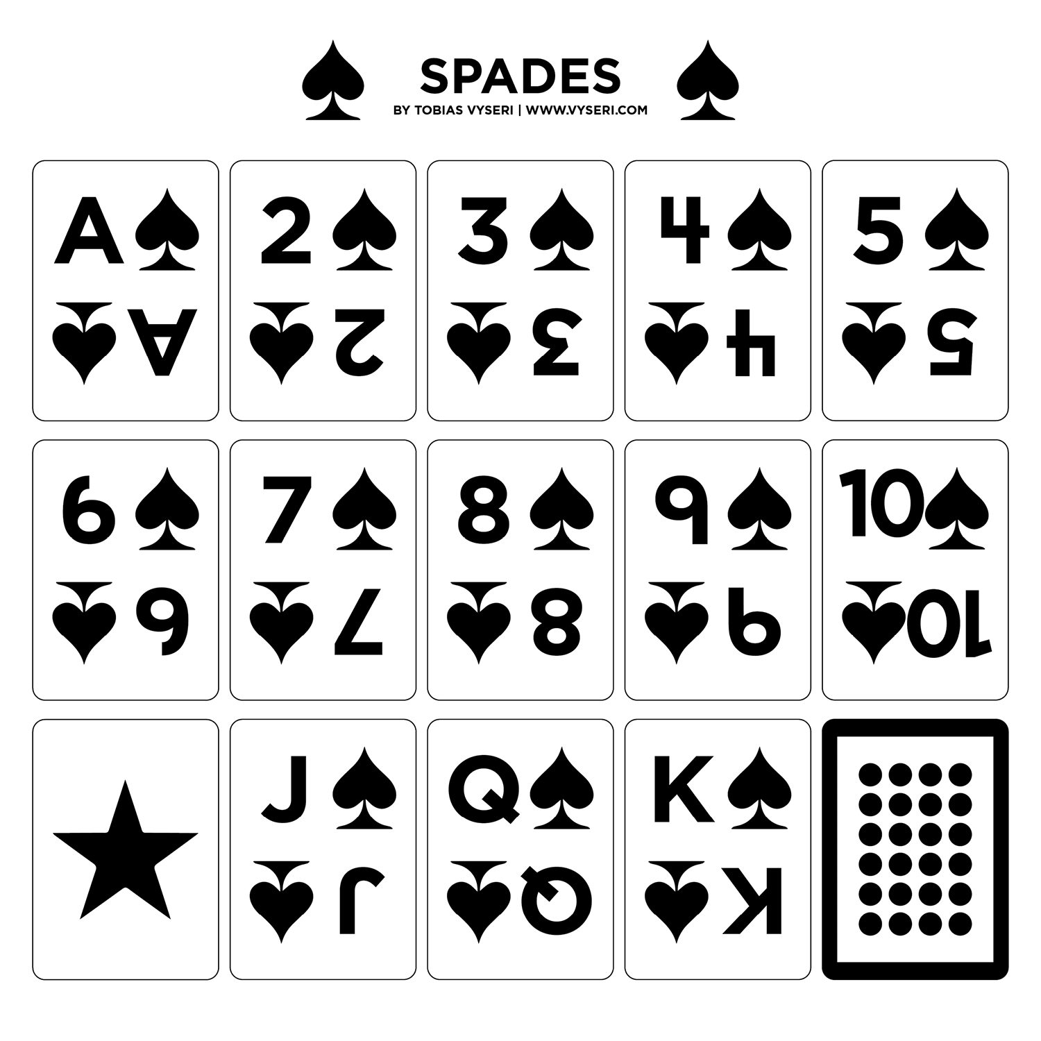
| Spades
Purchase on Etsy
Diamonds
| Hearts
| Clubs
| Spades
Purchase on Etsy

Concept
This one was a bit of a different kind of project for me. My partner’s mother is a caregiver for a man who's over 100 years old named Arnold. He plays bridge and other card games several times a week but his eyesight is failing and traditional low-visibility playing cards didn’t really work well for him. He's a retired draftsman, and had some ideas about how he would design a deck if he could still draw. She contacted me, wondering if I could help bring them to life.
Method
This was... definitely out of my wheelhouse. Basically my partner's mother asked Arnold for ideas, described them to me, and kept running drafts by him to confirm whether they would work or not. The way she explained it to me was “if you turn off most of the lights, squint your eyes, and then look at the cards, that’s an approximation of how he sees things”.
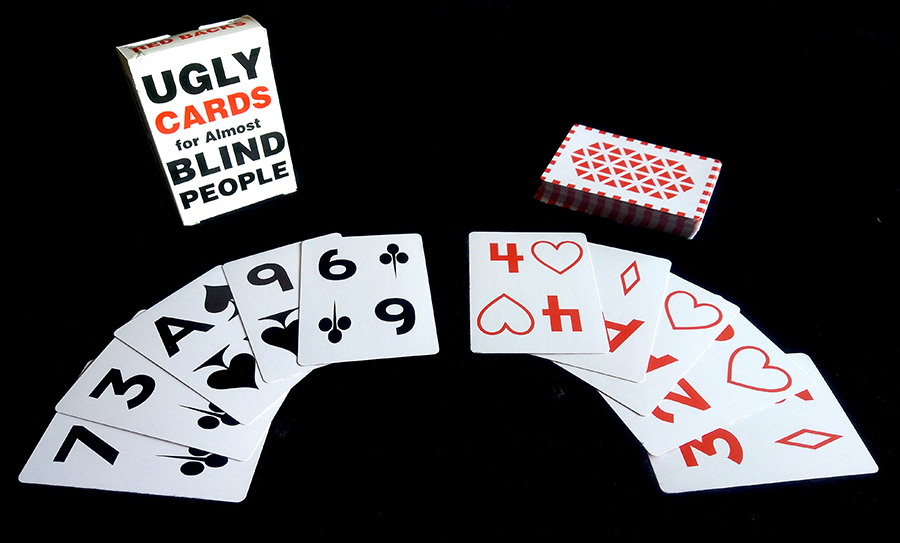
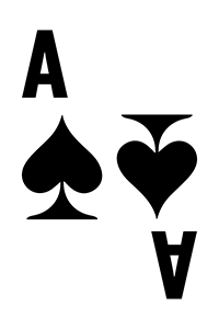
I mentioned the low-visibility cards currently on the market, and asked why those weren't working. She replied that the line in the middle and the small suit in the corner were both “visual noise”. In addition to this, Arnold hates when green, blue and yellow are used to differentiate suits, since this is useless for some types of color blindness, as well as for him. She also mentioned that because they didn't modify the suits, numbers, or letters, they all had a host of small issues that just made them frustrating to use.
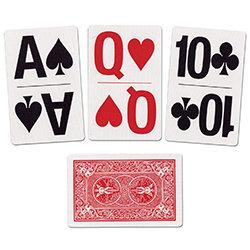 Bicycle low vision deck
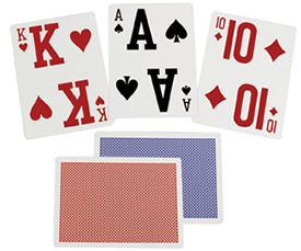 Reizen low vision deck
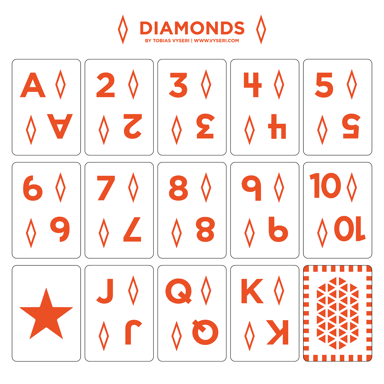
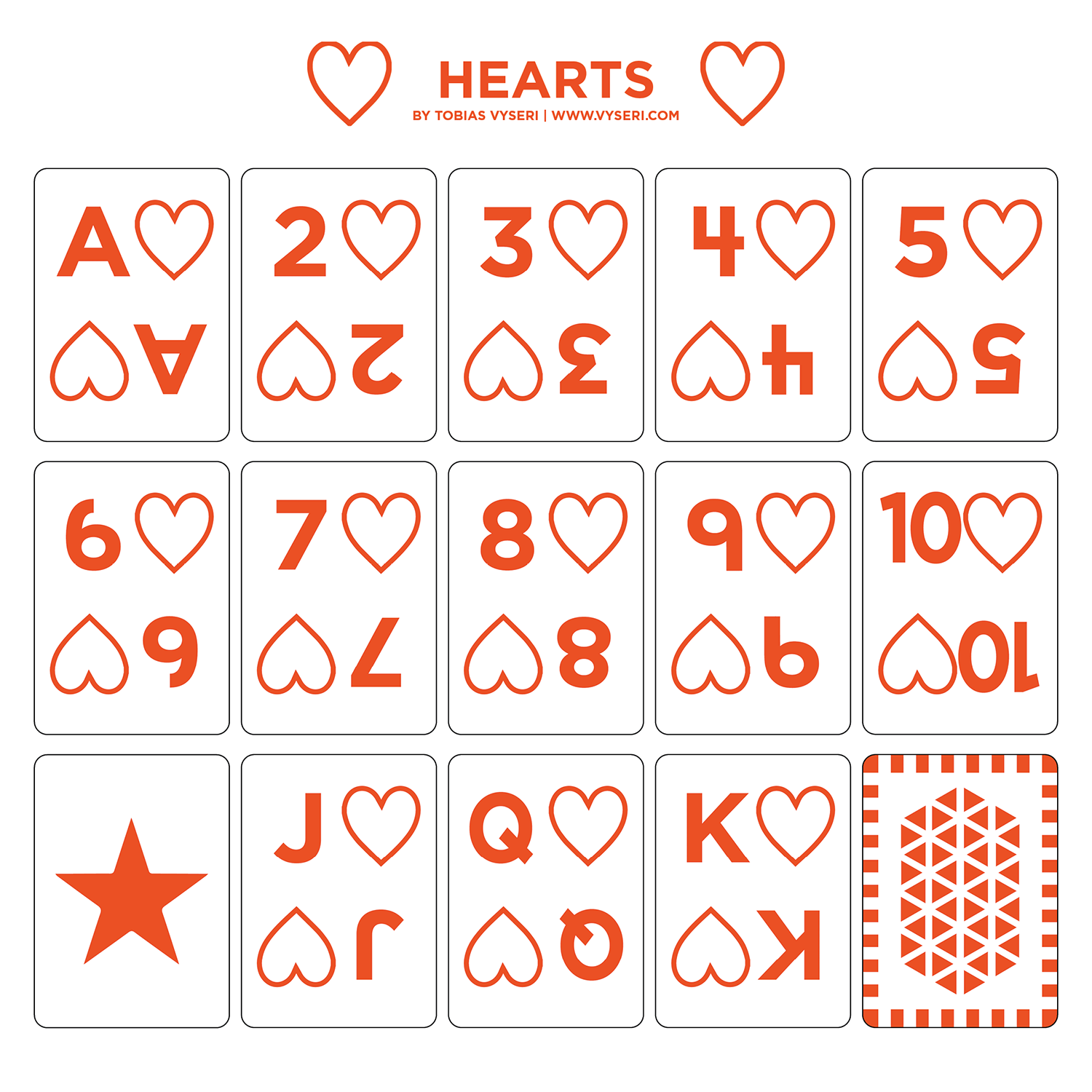
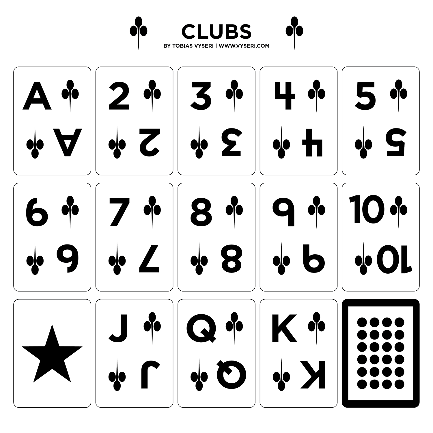
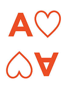
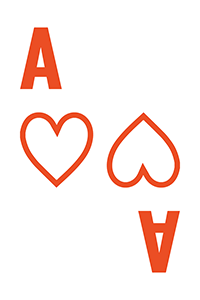
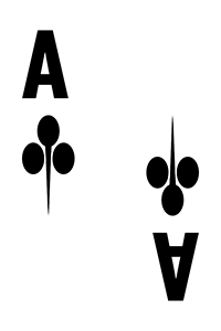
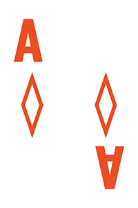
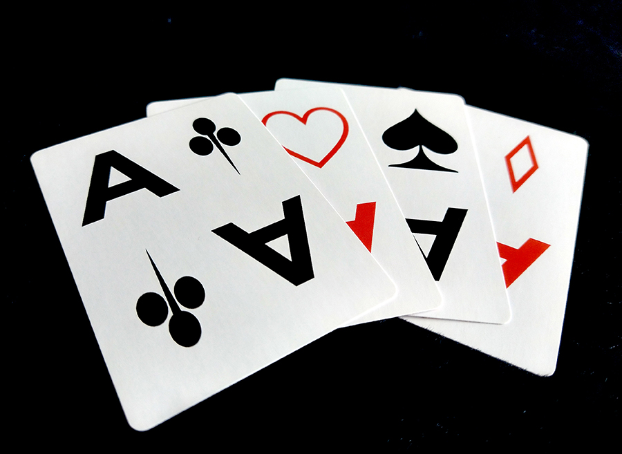
The first thing was to redesign the suits. For the hearts and diamonds Arnold wanted each symbol to be outlined and not filled in. With traditional cards he was having issues with the red and black looking very similar, since they have the same saturation. Having the red suits be only an outline changed the saturation completely. The next thing we needed to do was to ensure the symbols looked distinct from each other. The heart was kept wide and full but the diamond was narrowed significantly so that it had a very different width than the heart. Similarly, the spade was kept large and full with a big tail at the bottom to help differentiate it from the club, which had no bottom element. The club was also split into three balls to further avoid any similarity to the spade and to add more white space between the elements of the club.
 Hearts
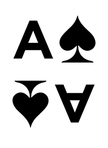 Spades
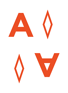 Diamonds
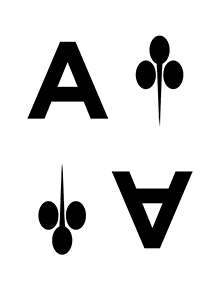 Clubs
Clubs
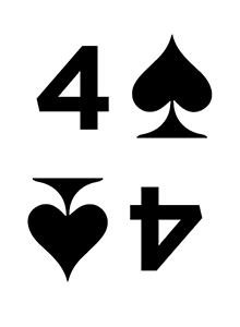
The next thing to work on was the font. I knew right away a clean, sans-serif was the way to go. No confusing slabs or weird letterforms here. There were a few characters, however, that needed to be changed. The 4 needed to be changed to a “goalpost” style 4 rather than a closed 4, in order to avoid confusion with the ace.
 Default Four
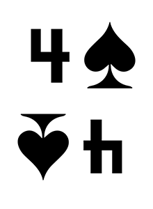 "Goalpost" Four
The 6 and 9 also needed to be modified in order to differentiate them from the 8; the hanging tail of both numbers wrapped around too closely and was causing confusion.
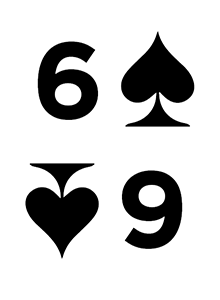 Old Six
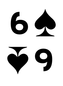 New Six
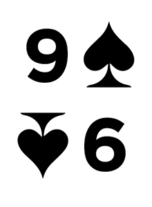 Old Nine
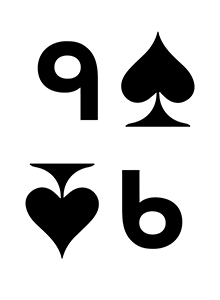 New Nine
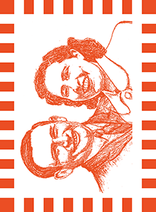
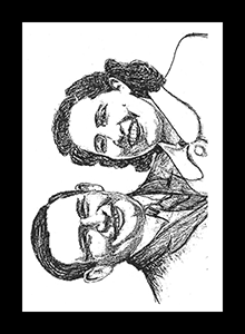
For Arnold's version of the card backs, we went with a sketch that he had done of himself and his wife when he was younger. I made the red border dashed to once again help distinguish it easily from the black.
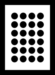
For the regular retail version I decided to go with two different geometric patterns on the backs.

Because Arnold plays two different card games frequently I needed to also design playing cards at bridge size (as opposed to poker size, which is where I design more of my cards because it’s the same size as Magic: the Gathering). I was a little worried about condensing the font and moving the symbols so close to each other, but there really weren’t a lot of options for this one, and Arnold and his bridge buddies say they work just fine.
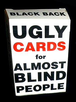
Finally I needed to make a box for the “retail” version of these cards. I decided at this point to embrace how ugly I thought they were and have some fun with it. I was a little worried it might be offensive, so I ran it by a few people, but in general people seemed to get the humor and felt I was making fun more of myself and the design than anything else.
Reflection
Initially this project was frustrating because I kept wanting to try and make it look good, and each time I got changes it was usually stripping any sense of design I’d imbued into the project. Once I decided to let go of the notion of trying to make it pretty, it got a lot easier, and I had an alright time with it. And my partner's mother keeps telling me that they bring joy every day to a man who thought his ideas would never be put into practice, and that usefulness is its own form of beauty.
 Diamonds
| Hearts
| Clubs
| Spades
Purchase on Etsy
Diamonds
| Hearts
| Clubs
| Spades
Purchase on Etsy