 Brand Guide

Concept
This was a client that wanted a complete redesign of their logo and aesthetics.
Method
Whenever I do a client branding project, the first thing I work on is the logo. For this one I was given their old logo, though I was told they wanted their new one to look nothing like it.
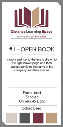
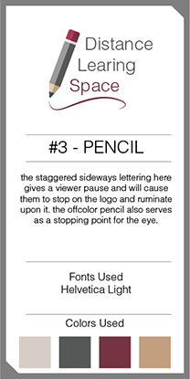
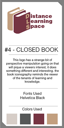
After I hammer down the logo I can work outward from there to figure out a broader aesthetic from the baseline fonts and colors already used. I started out by giving the client four different logo options. I was given a color scheme by the client.
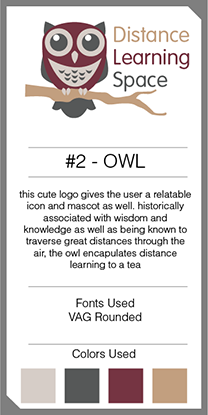
The client noted that they really liked the one that featured the owl and wanted to incorporate technology into that theme, as they were an online learning service.
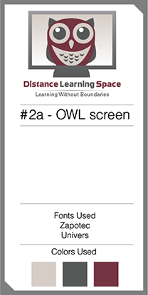
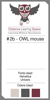
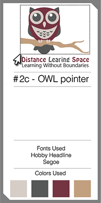
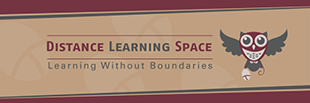
Eventually we settled on this iteration of the logo:

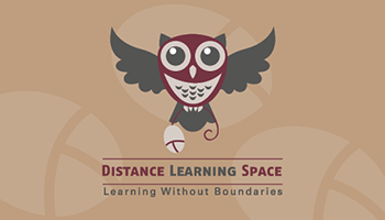
From there I set to work on the rest of the package. I gave them a black & white version of the logo in addition to Facebook and Twitter banners and avatar-sized items for both sites.
 Twitter banner
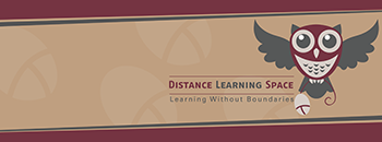 Facebook banner
I also made them some print media, including business cards. Initially I offered them a traditional horizontal business card, but they wanted something vertical instead.
 Horizontal Front
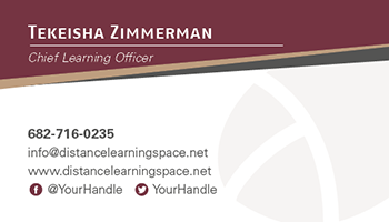 Horizontal Back
 Vertical Front
 Horizontal Back
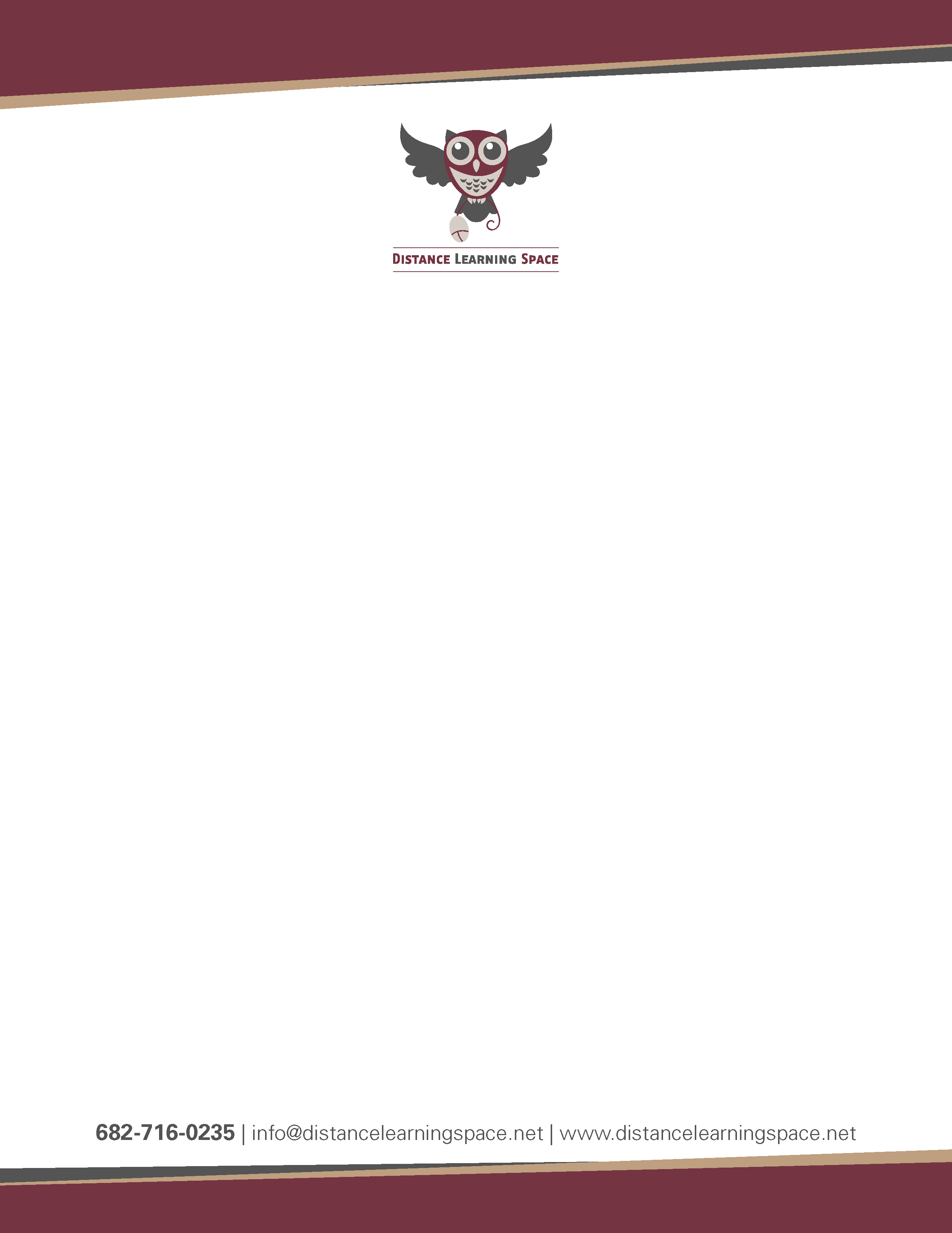
Finally I was almost done, just two things left, the letterhead and the brand guide. The letterhead was easy enough, and the brand guide went through no revisions!
Reflection
I'm pretty happy with how this one came out, the owl is super cute and was fun to work with. I enjoy design projects more when there's a mascot character for me to latch onto. The client was also pretty happy with it from what I gathered.