Pacific Pilsner Rebranding
Project Completion Time : 2 Weeks | Completion Date: 30 March 2015
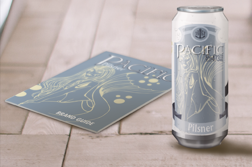 PDF of Brand Guide | Can Mockup

Concept
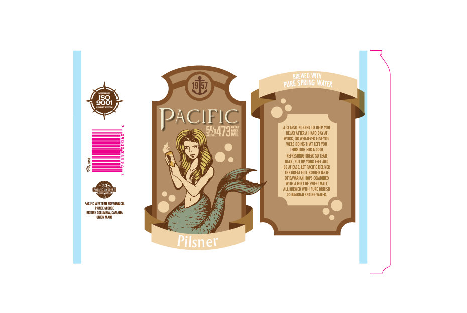
The Pacific Pilsner redesign is meant to appeal to the nostalgia of the long time drinkers but also appear fresh and new to draw in new customers. The image of the mermaid tells people there's something new, but the soft familiar colors and name accompanied by the characteristic anchor denoting longevity give the returning customers that sense of comfortable familiarity. I strove to capture the serene sense of the west coast and combine it with something exciting, modern, and easily recognizable on the shelf.
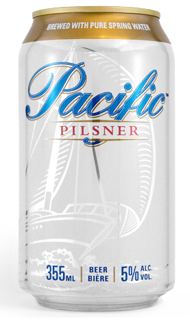
the current branding of Pacific Pilsner
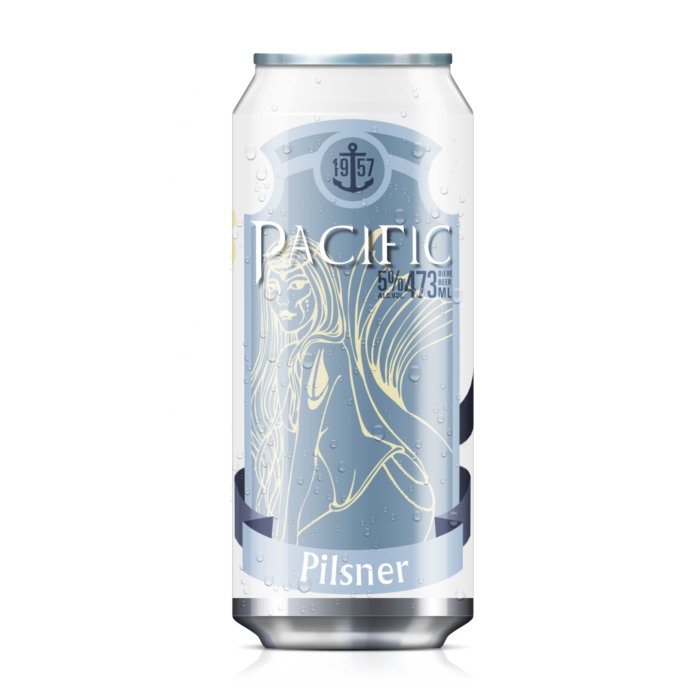
What the final version of my redesign looks like
Method
This project had a lot of elements to it. First there was the drawing, I did an intial sketch after looking at many different beer labels and incorporating elements I liked from each one. The original concept used a brown color scheme but after brining it in to illustrator I didn't like the mermaid or the color scheme. So I drew a different mermaid, slightly sexier and more exotic looking and freshened up the color scheme to match, I had to move around a few elements to make room for the new drawing, but overall I think the update was worth it.
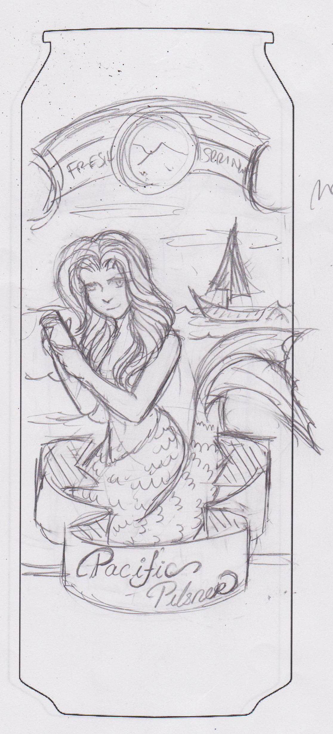
the first draft of the sketch
the brown label
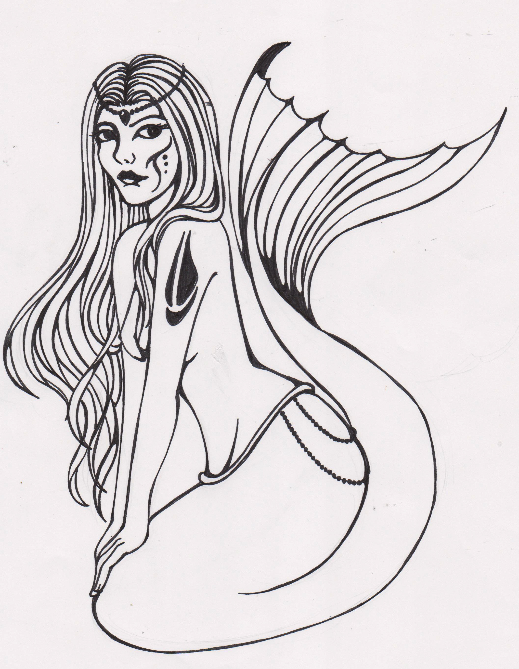
the red-draw of the mermaid

the final blue label
For the brand guide I followed a similar method to the Visvana Today magazine. I looked at many other brand guides before I decided on a number of pages and what to include and what to leave out. I planned my pages on a sheet of paper and then set to work dropping in elements and tweaking the design.
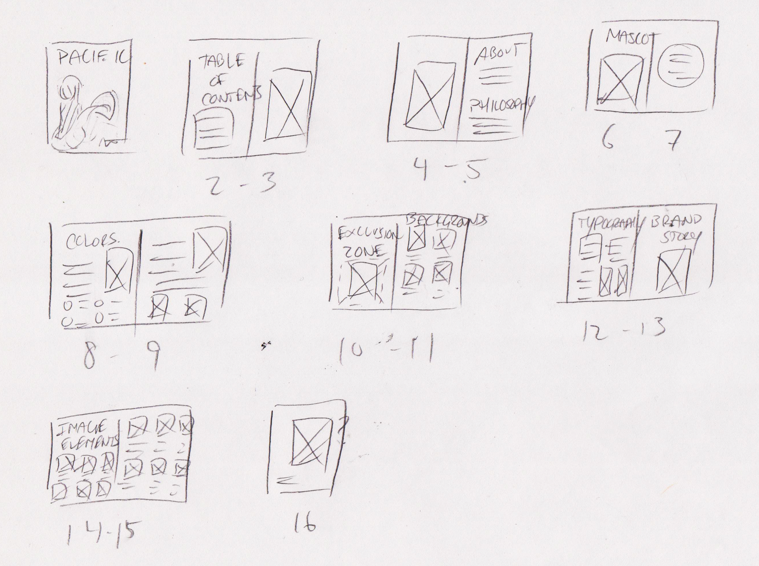
the sketch for the layout of the brand guide
Reflection
This project I'm actually quite pleased with, I feel the colors are strong, the design is simple and modern. And yet, it's not a project I fly the flag of proudly, because it feels so generic. I feel like there's none of me in this project. It's a stoic soulless guide designed for a box corporation. Which I suppose is how the industry wants you to be able to design. And also why I feel it's probably one of my best portfolio pieces. Because it lacks individuality and personality, it shows I can conform to whatever brand standards are set out for me. overall I'm happy with the outcome and am glad I did the project. Honestly, there's nothing I would really do differently.
PDF of Brand Guide | Can Mockup