 Cups | Staves | Pentacles | Swords | Major Arcana
Purchase on Etsy
Concept
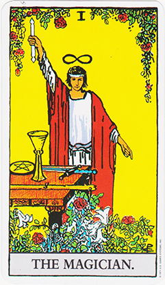
It was a month before the end of class, I had already completed the course requirements, and I had a choice. I could sit and do nothing for a month, or pull one of the big projects out of my bag and work on it. Being deathly afraid of boredom I chose the latter. A standard Tarot deck consists of 78 unique cards. I knew it was ambitious, but I've never shied from a challenge. However, I wanted to make it unique. I've painted a good deal of medieval fantasy pieces and wanted to try something new. At the time I was familiarizing myself with the World of Darkness role-playing setting. I decided then, to do a Victorian Gothic themed deck. Each suit was given a different horror trope; the cups would depict vampires, the staves were witches, the swords would be monster hunters, and the pentacles would be represented by H.P. Lovecraft inspired abominations. A tarot deck, however is a very symbolic kind of thing, and I didn't want to lose that in the aesthetic translation, I wanted to make sure I captured the spirit of the traditional Rider-Waite imagery!
 Traditional Rider-Waite Deck
Method
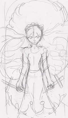
For each suit I picked a theme, as I said, and for each card I started by looking at the Rider-Waite image and thinking about what it would look like in my setting. Sometimes I wasn't sure what the card was trying to convey so I would look up the meaning and see if I could capture that. Then it was my traditional process of sketching, scanning and painting.
 sketch concept
 rough coloring
 touch-up & details
 2016 Touch Up
A few things I want to highlight that happened during this stage. I would start with the Rider-Waite and then adapt the imagery into my theme. Like with the magician below; I featured a witch using the symbols of the other arcana (which are present in the original card) to cast a spell. I also put the infinity symbol on her hat instead of floating above her head, as in the original.
 Original Rider-Waite Magician
 My adaptation, featuring concurrent imagery
 Now I want to talk about the major arcana. Many of the major arcana cards relate back visually or symbolically to the Fool's journey, ending at the World. I wanted to capture a little bit of this and have a recurring character for the fool. I chose a Lolita girl, as something that's fairly common in a horror genre.


Of course I didn't want to shoehorn her into every card, as that would certainly force some strange imagery, so instead the second thing I did to make the major arcana really shine was to depict all the characters with white hair. A small thing to be sure, but I wanted it to be just enough to subtly make the viewer notice that "hey, there's something different about the major arcana".


The first print run of the decks was about 6 decks. When I sold those, I ordered 30. when I sold those I ordered 50. Finally, in 2016 I started looking at ordering larger quantities, and I thought to myself "this project is starting to look a little old, the art is actually kind of embarassing" and I knew it was either a choice of discontinuing it or touching it up. I figured it wouldn't take too long to go and fix some of the errors, and I felt the concept was strong enough that it was worth it. So I spent about a week going through and using some of the new techniques I had learned to make it something I could be proud of again. Overlay layers were added, faces were changed to be more realistic (I had spent a while that year painting face studies) brush strokes were smoothed, moons were rounded, and with just a little extra effort the project was shiny and new again! The font and general layout were also tweaked a little to give the entire deck a fresh feel.
 Old 5 of Staves
 New 5 of Staves
 Old Queen of Staves
 New Queen of Staves
 Old Queen of Pentacles
 New Queen of Pentacles
 Old High Priestess
 New High Priestess
Some cards were so horrendously unsalvageable that they basically needed to be re-drawn entirely.
 Old Knight of Swords
 New Knight of Swords
Something else that was fixed in the update was the cardback


The first print run of this project was pretty austere, just a plain white tuckbox with cards in it. When I looked at doing a larger print order it was around around the same time I was printing my Apocalypse Playing Cards. I had just switched printers to one that could not only do larger quantities, but could also do a whole suite of new and exciting printing techniques. I decided to try out the gold stamping on the tarot deck (finding the intricacies of the Apocalypse Cards a better fit for the gold ink) as well as the gilded card edges. Both came out pretty striking!
 Gold Stamping
 Gold Edging
Reflection
I am overall pleased with how this project turned out; it was a lot of work, but it was worth it. There are a few images that suffered in quality due to the time constraint that I'd like to go back and touch up. The card backs were also something I've never been really happy with, but overall I feel it came together quite nicely.
 Full Set of Card Images:
Cups | Staves | Pentacles | Swords | Major Arcana
Purchase on Etsy