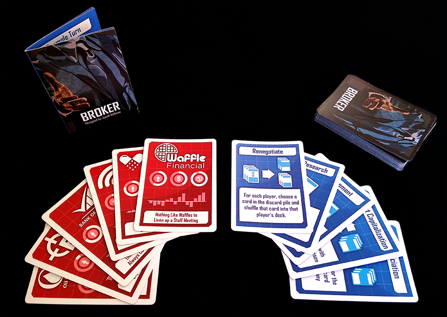
 See Full Rules Here
Purchase on Etsy
See Full Rules Here
Purchase on Etsy

Concept
One of my friends in the Magic judge program got wind of the fact that I do design work and decided to ask me to do an overhaul on the the aesthetics for his game. He'd had a successful kickstarter previously but wanted to spice up the graphics a little and do a re-release. Card games are my forte so I was really excited to work on this project!
Method
I already had all the old assets, and wanted to keep things similar but clean it up a little. I knew I'd be keeping the red and blue color scheme, but the original colors were a bit dull. I also decided to ditch the cloudy texture in favor of something a little more "blueprinty" looking. I added a little shine in the background as well to enhance the modern feel. Another issue with the initial design is the floating text; the graphical elements and the text are floating nebulously in the same space. I decided to divorce them a little by creating defined and outlined space for each of the elements. I also decided to pick a better font.
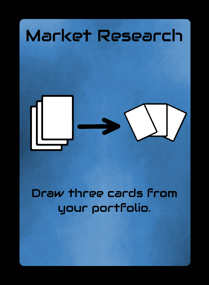 Old Market Research Card
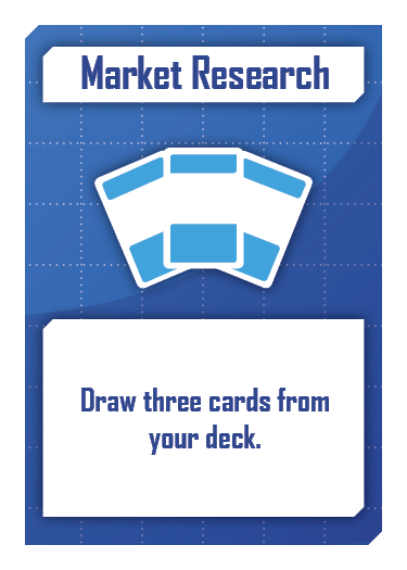 Redesigned Card
Another thing I decided to tweak were the icons used for different actions. I changed the discard pile to a deck with a dollar sign on it instead of just the dollar sign, and changed the black and white decks to be a blue and white deck; blue for opponents cards and white for your own cards.
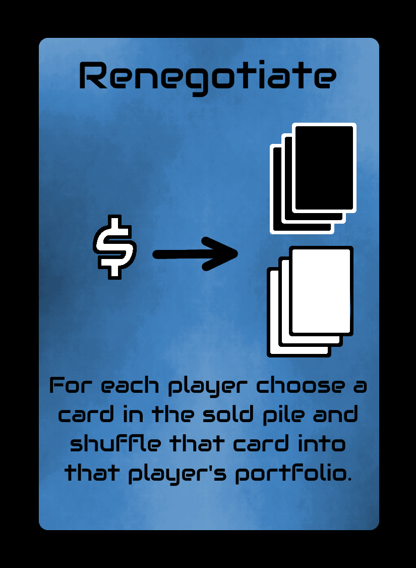 Old Renegotiate Card
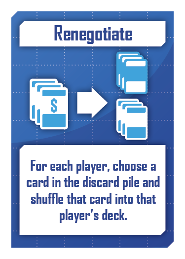 Redesigned Card
The card back was already supplied, and frankly, it was already really nice. I did decide to ditch the "Copperplate" font they used in favor of the font I was using on the rest of the game. I also lightened up the text and added a dark glow around it to really help it pop. The dark aesthetic was kind of in opposition to the brighter redesign, but I feel like it still works nicely.
 Old Card Back
 Redesigned Back
Finally, there were a series of "company cards" that featured logos of different theoretical companies. They have no rules text and only had the name, logo, and tagline on the original cards. During the redesign I noted that this ended up with the red cards being a little empty looking. I decided to add some cute but ultimately meaningless graphs to help fill the space. Also many of the logos underwent a big redesign.
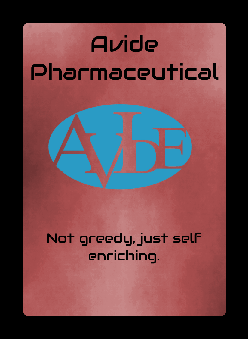 Old Avide
 Redesigned Avide
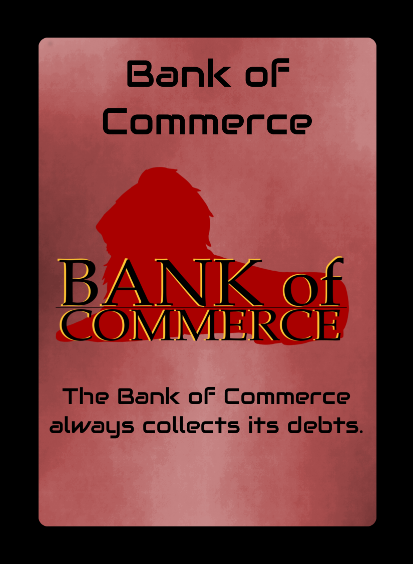 Old Bank of Commerce
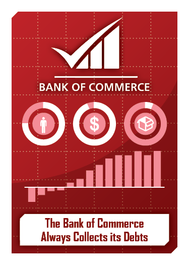 Redesigned Bank of Commerce
The next challenge with this project was to redesign the box. The biggest issue with the old box was the font. Courier is not really a font I want to see as part of a game design unless it's something digitally themed. I also freed up the boxes containing the time and player count logos as well as brightened up the box to match the new aesthetic.
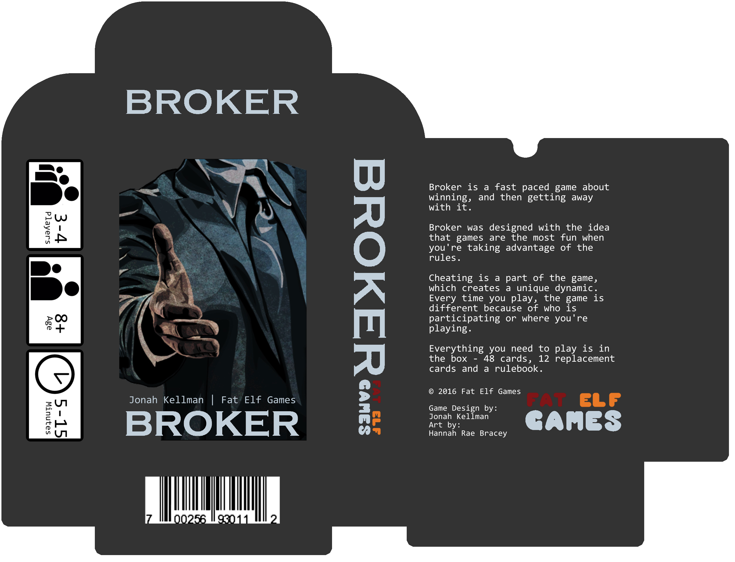 Old Box
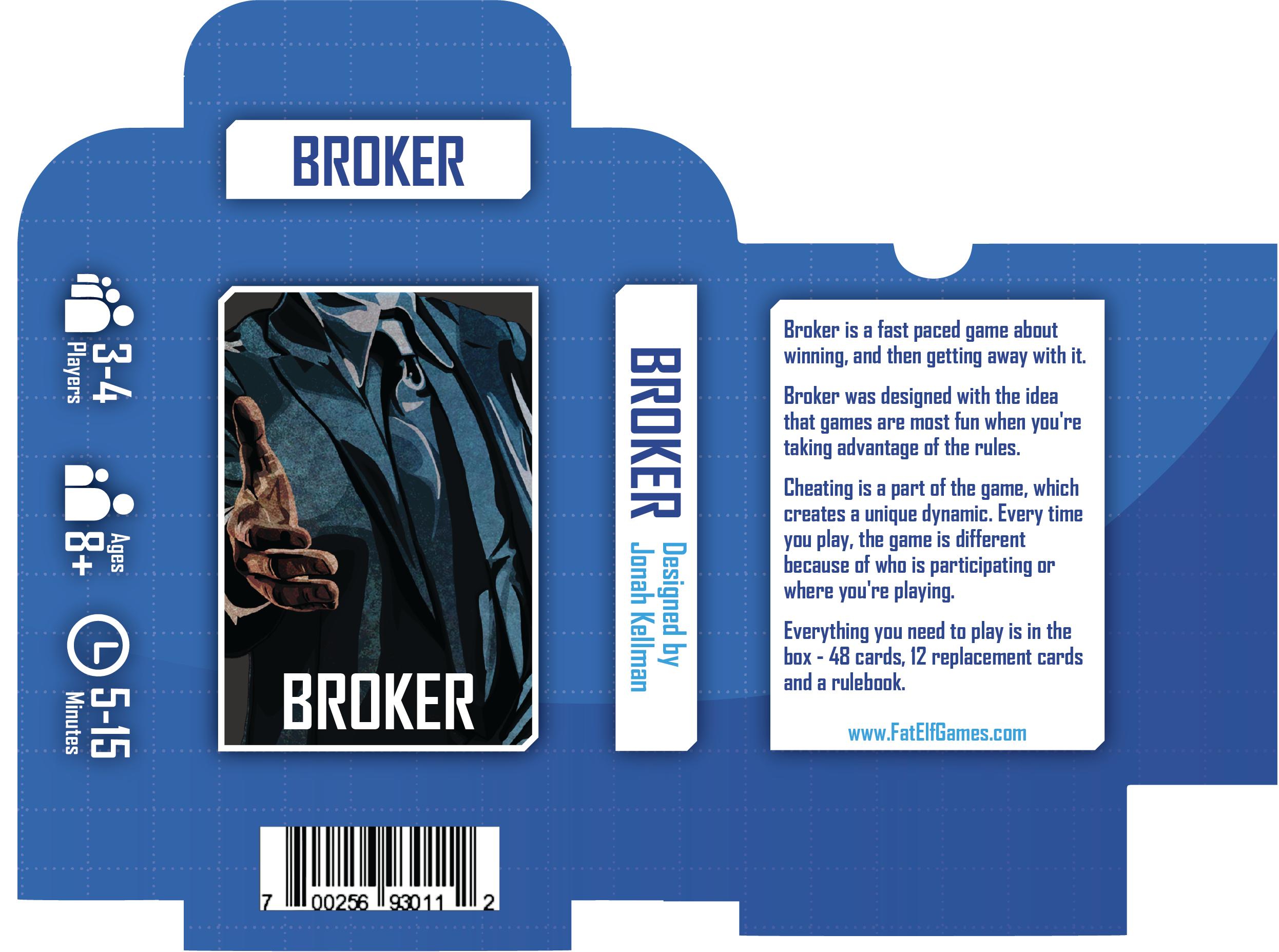 New Box
The final part of the project was to redesign the instruction manual. The manual was the same size as the cards, so I had to be careful in picking a font size to ensure that it was still readable. Aesthetically, I didn't do anything too special here, just brought the text into the new design.
.png) Old page from rules
Old page from rules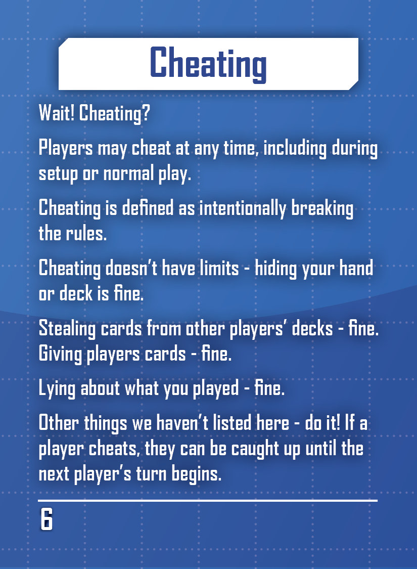 New page from rules
Reflection
I had a lot of fun with this project, I felt like there was a lot of creative freedom and the creator of the game was really easy to work with.
Purchase on Etsy