
Concept
HBMO is a large tournament in Texas that raises money for suicide awareness. It was started when its namesake Hunter Burton, committed suicide and has been going strong for about 10 years now. I was excited to work with an event that both aligns with my values and has such a strong legacy.
Method
My first job for them was some simple badge designs. I wasn't given much direction, so I used a generic background pattern, and put some clean text on it. The back was more of a logistical challenge. Initially they provided way too much information. After a little back and forth we managed to get the information density to a more manageable amount.
 Badge front
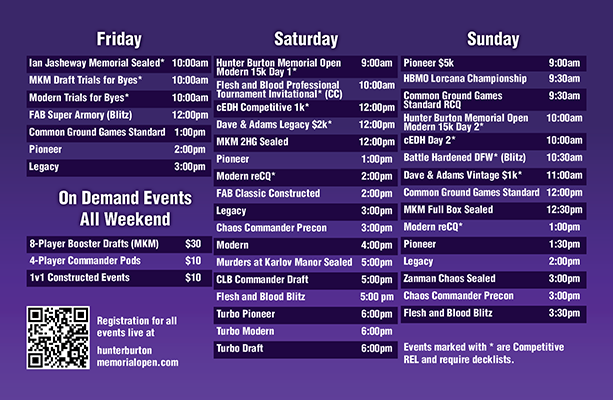 Schedule on back of badges
They must've worked out, because they asked me to do them again the next year. They also asked me to put together a "save the date" business card for advertising.
 2025 Badge
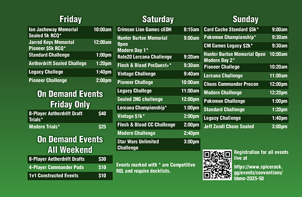 2025 Schedule
.png)
.png)
In early 2025 there was a bit of a kerfuffle within the organization. When the initial artwork for the event was released it contained an ai generated image of a cat. There was a lot of confusion as to whether this was supposed to be the official art for the event or not, but one of the volunteers reached out to me to produce something for their playmats, since they didn't want an ai generated image to end up on their mats. They told me they'd like something with animals and board games, since the event was expanding beyond just being a Magic: the Gathering tournament. I chose a dragon because it's a very iconic fantasy creature, a cat because their ai image had a cat and a crow because I can't make something without a bird on it.
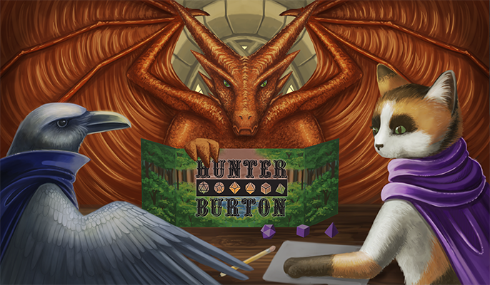 First Draft
 The feedback was that this was too board game centric, so I retooled it to include a Magic: the Gathering board state. I decided to re-draw the dragon, since the original pose wouldn't work for a card game setup. I also decided to make the crow less angry. The feedback from that iteration (which has unfortunately been lost to time) was that it should feature many different card games. Since the event itself was running a large Pokemon event, as well as a Flesh and Blood event. So I took to the drawing board again. In this version I not only included FAB and pokemon cards, but also some traditional playing cards and even an Uno card for extra quirkiness!
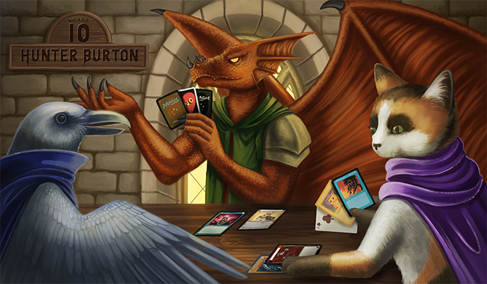 2025 playmat design
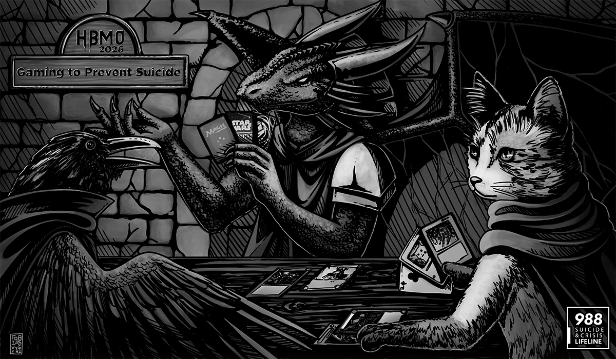
Unfortunately due to more confusion within the organization, it seemed that someone unbeknownst to the others, had hired a different artist to do the playmat designs! This was a little demoralizing, I had been looking forward to my work being in front of so many people. But such is the life of an artist, and sometimes things just don't work out. Luckily the next year they reached out to me to use the design! I opened it back up but realized that I had improved a bit, and there were certainly some things that needed touching up. I fixed the perspective on the bricks in the back, updated the lighting to be more realistic, and overhauled all three character designs. The cat and dragon in particular getting the biggest facelifts. I also added some more detail work to the masonry in the background. After touching it up I was a lot happier with it.
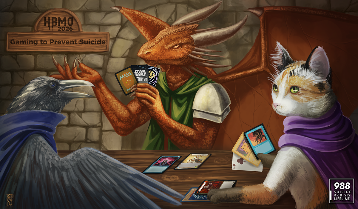 2026 update
They then asked me to make a black and white version for the VIP package. They suggested just greyscaling it, but I felt that was a little "cheap", so I added some shading work to make it really pop more. In the end I might like the black and white one more!
 Black and white version
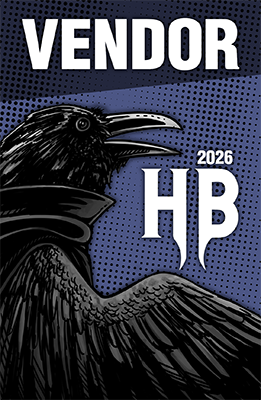
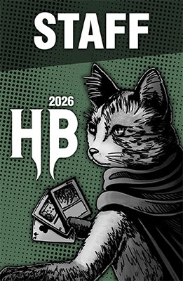
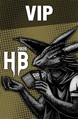
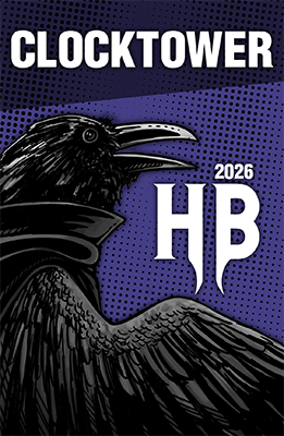
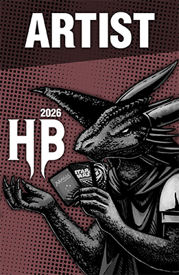
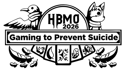
I was then asked to make some badge designs, but to have them tie into the playmat artwork, to give the entire event a coheisve brand identitiy. I decided the black and white version of the characters was easier to use as iconography, and put each animal onto a badge with a unique color and a kind of comic-booky texture in the background. There were five badges and only three characters so two of them needed to be re-used. I opted for the Dragon since it was more iconic and the bird because I'm partial to our avian friends.
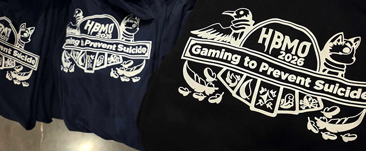
The next task to tackle was the t-shirt design. Typically they use the playmat artwork and plop it on a shirt, but I firmly believe things look better when the medium they're designed for is taken into account. instead of sticking a square piece of artwork on a shirt I wanted to make something that looked like it belonged on a t-shirt. The first design featured the animals but was pretty heavily shaded. After fiddling with it, I felt that the design didn't scan as well as I wanted it to and simplified it a bit. After I locked in the artwork the organization asked me to present a few different text options.
 First Draft
 cleaned up design
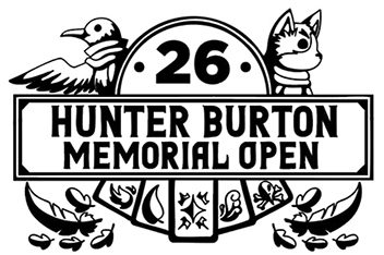 Text layout option
in the end they chose a version with the suicide awareness tagline. I noted that this shape was the same as the plaque on the playmats, and perhaps we should update the plaque on the playmats to match the shirts, they agreed and I went back and changed out all the text.
 one text layout option
Reflection
I really enjoyed working on this project, I like working with animal mascot characters and I got to kind of blossom out to design a bunch of different aspects of the tournament material. One regret is that I never made a schedule for the badge backs for this event, I reached out and asked a few times, but the schedule wasn't finalized in time for me to get something to them. Overall it was a great experience and I hope I get the opportunity to do it again next year.