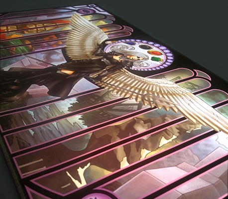
 Flat Image
Purchase on Etsy
Concept
This one started out as a commission; I was asked to create a set of playmats for an event running on Vancouver Island.
Method
Initially I was asked to make two playmats: a generic entry mat with the Comox Valley Glacier on it, and a top 8 playmat that had some elements of the entry mat on it so they felt like a set. The client expressed that he would like the mats to be in Art Nouveau style, in a similar vein to my Art Nouveau Planeswalkers.
The description for the first playmat was the iconic Comox Valley Glacier with a small mage running from a Lhurgoyf. So I gathered some reference material.
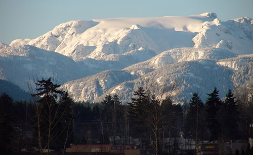 Image of the iconic valley glacier
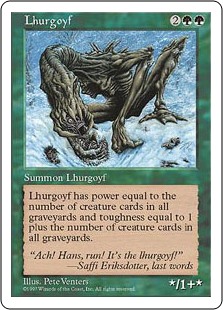 Image of Lhurgoyf
After gathering all my reference images I realized that while the Art Nouveau style lends itself fairly easily to clothing and people, I didn't have a good idea of how to handle it when doing a more natural piece, so I found myself a reference image.
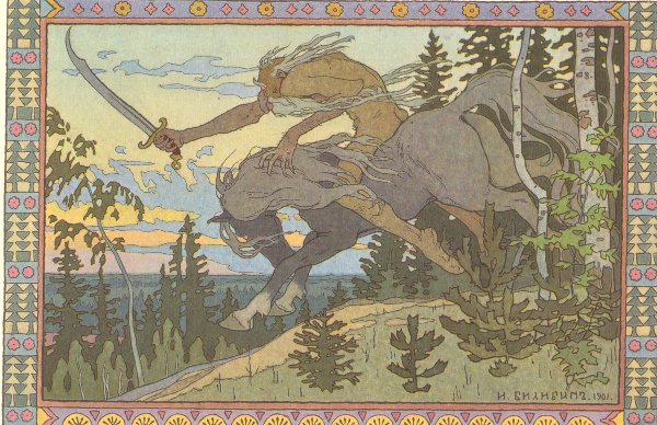 Nature in the Art Nouveau style
After compiling my reference material it was just a long process of drawing and revising.
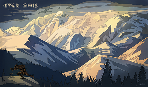 Artistic rendition of the glacier
Then I set myself to work on the top 8 mat. I knew I wanted it to be something special. The client description was "a female mage countering a mox, or if you have any better ideas go ahead, just as long as it looks good". So I hunted around for reference images again.
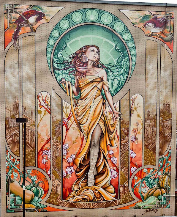 Reference image for the top 8 mat
I really liked the idea of panels in the background. I figured a good way to incorporate the general mat into the top 8 mat would be to have it appear in some of the panels as a bit of a throwback. I also really liked the pose and clothing folds on this image. I began work on the central figure. I very early on decided that it would be better to have the "female mage" be an existing character in MTG to make the mat more appealing to players of the game. While looking for iconic blue mages I quickly ran into a problem in that the figure would only dominate a very small portion of the center of the mat due to its horizontal nature. After a little more searching, I decided instead to change the image to an angel, so that the wingspan could spread across the playmat.
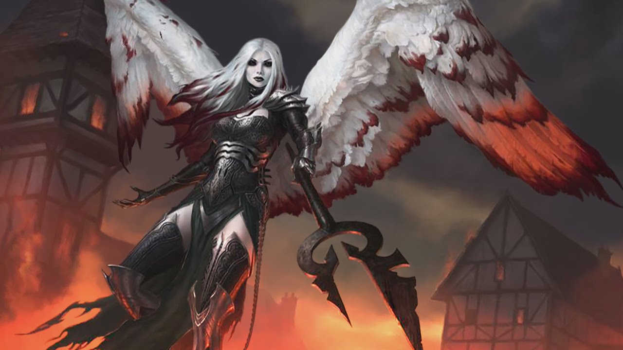 Reference image of Avacyn
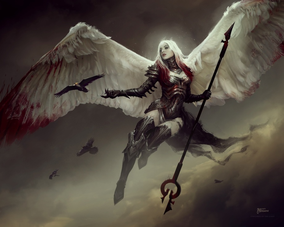 Another reference image of Avacyn
So I happily went along and began drawing. I couldn't have Avacyn countering a mox because well, she doesn't counter things, she's red-white. So instead I figured she'd just be posing with the moxes. At this point, I was pretty far away from what the client had requested, but also felt like I had been given a lot of artistic freedom. After finishing the figure I dropped the glacier mat into the outside and center panels, but this left four panels without imagery!
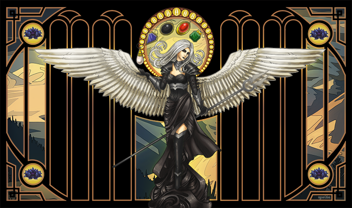 We're getting closer, but what should I put in those empty panels?
I ended up deciding on different scenes of Vancouver Island, to make the mat feel really unique and special!
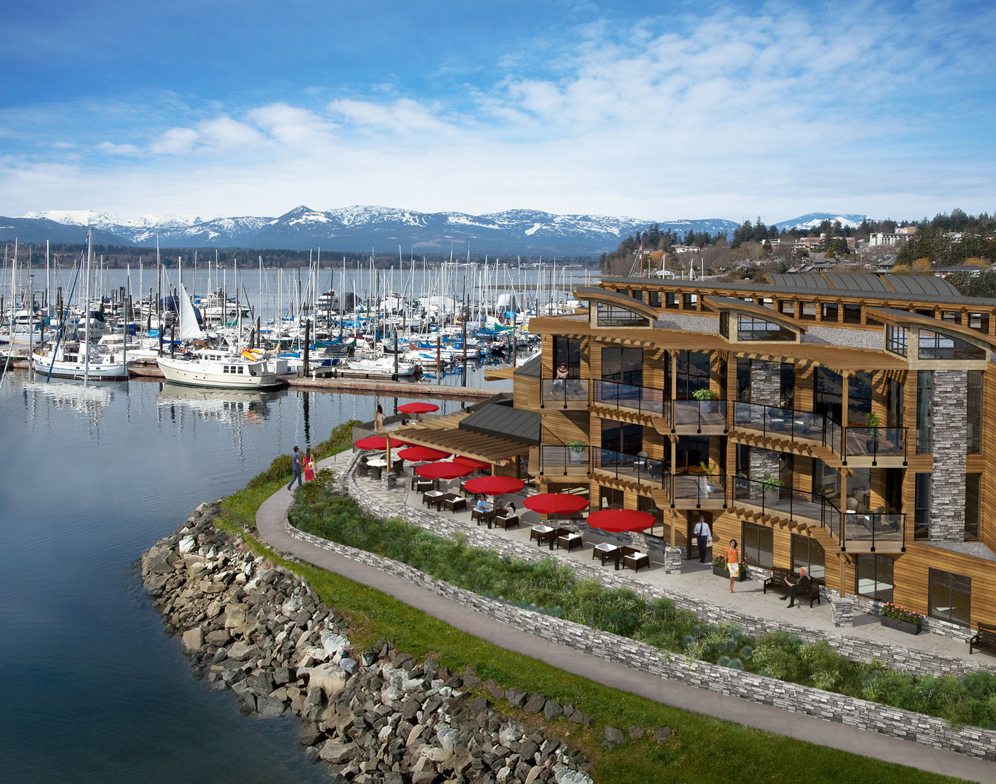 A coastal image
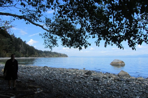 Some of the local nature
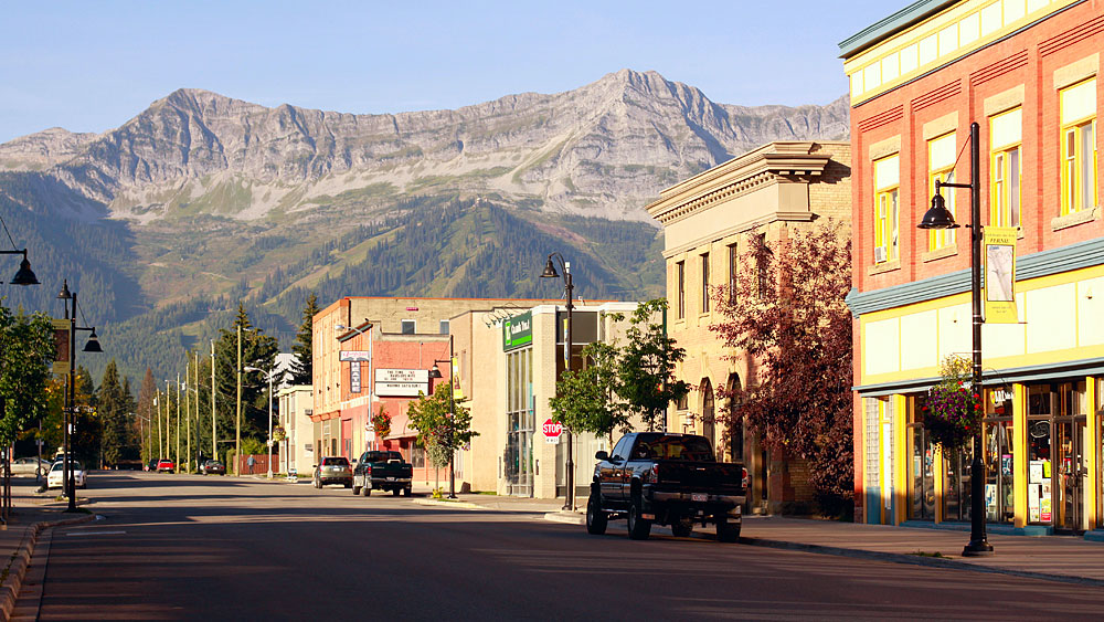 The small town shops that are indicative of the island
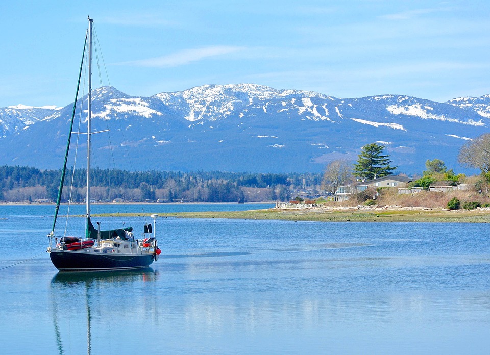 A familiar island sailboat
In the end I was very pleased with the mat. It ended up coming out pretty nice looking, both mats were tied together aesthetically, and the mat was both Magic and Vancouver Island related. The client was very pleased with the mat as well, which made me happy!
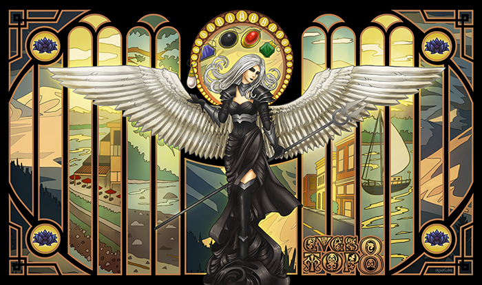 Final Product
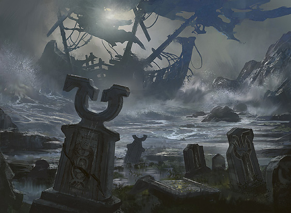
I was so happy with the design I spoke with the client and asked if I could make an alternate version featuring Innistrad imagery and sell it. Neither of us had really discussed reproduction rights to the image, since it was a very casual commission. He wanted it to be exclusive to his event, so agreed that if I changed the panels behind Avacyn I could sell it as a mass produced item. I picked out a generic scene of a graveyard on Innistrad to replace the glacier from the previous mat.
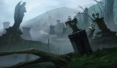 Graveyard to replace the glacier
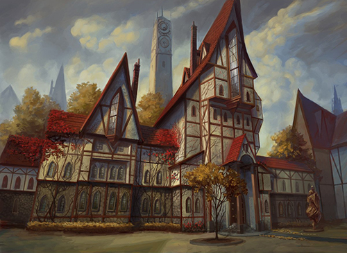
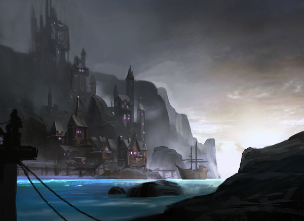
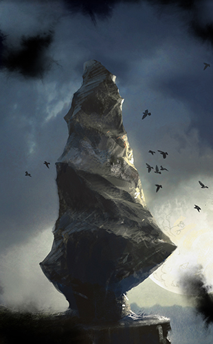
Then I spent a while looking through lands and iconic places on Innistrad and settled on some to use as panels.
After creating all the imagery, I realized that my previous set of yellow and sepia-colored overlays didn't mesh well with the blue and purple hues that were so prevalent in Innistrad's artwork. So I changed the piping on the windows to be purple as well as a few other elements to match. I fiddled with the color balance for a while before I was pleased with it. But in the end I feel it came out quite nice.
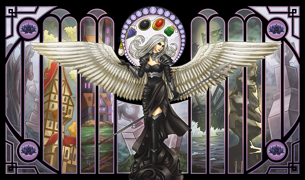 Final Mat
Reflection
I'm pretty happy with how this one came out. The scenes of Innistrad really help to tell a story and the purple tones help differentiate it significantly from the one the client used for their event. In the end it was a really profitable enterprise for everyone involved.
Purchase on Etsy
