VRI Branding & Design Work

Concept
This project was a series of commission pieces for Virtual Resources International, I worked with them for about 1-2 years creating various online marketing materials as well as printed material as well.
Method
The first job for VRI was to create a set of social media tiles that they could post periodically on their Facebook page. As with most clients, I gave them three different looking options for tiles. I was running a little low on ideas when I was working on them, so I gave them two that were "businessey" and one that was a little goofier.
A playful option
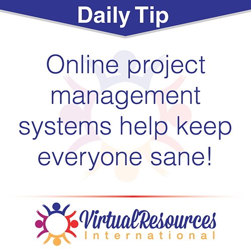
A cleaner look
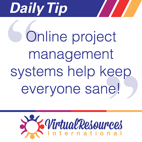
A more colorful option
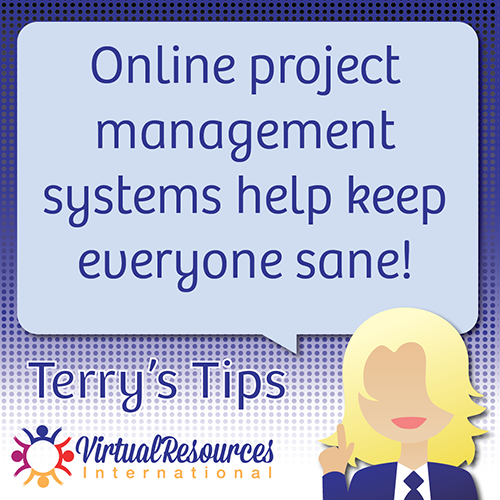
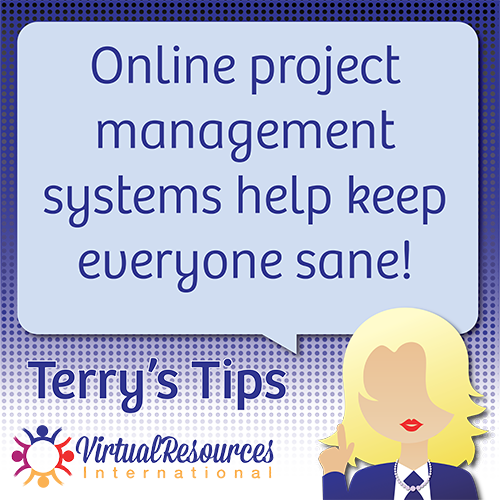
Suprisingly, they went for the playful option! I didn't expect that! They then wanted three different looking tiles for different aspects of the business.
Business Tips

Fun Quotes
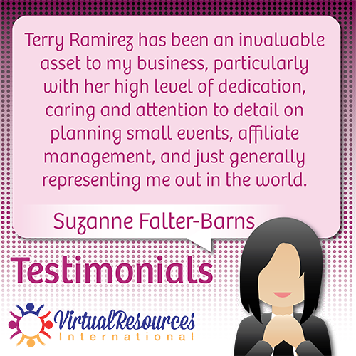
Testimonials
Initially I had three distinct characters, however the client wanted them all to look like "Terry" (the owner of the company). They also decided against the concept of a testimonial tile.
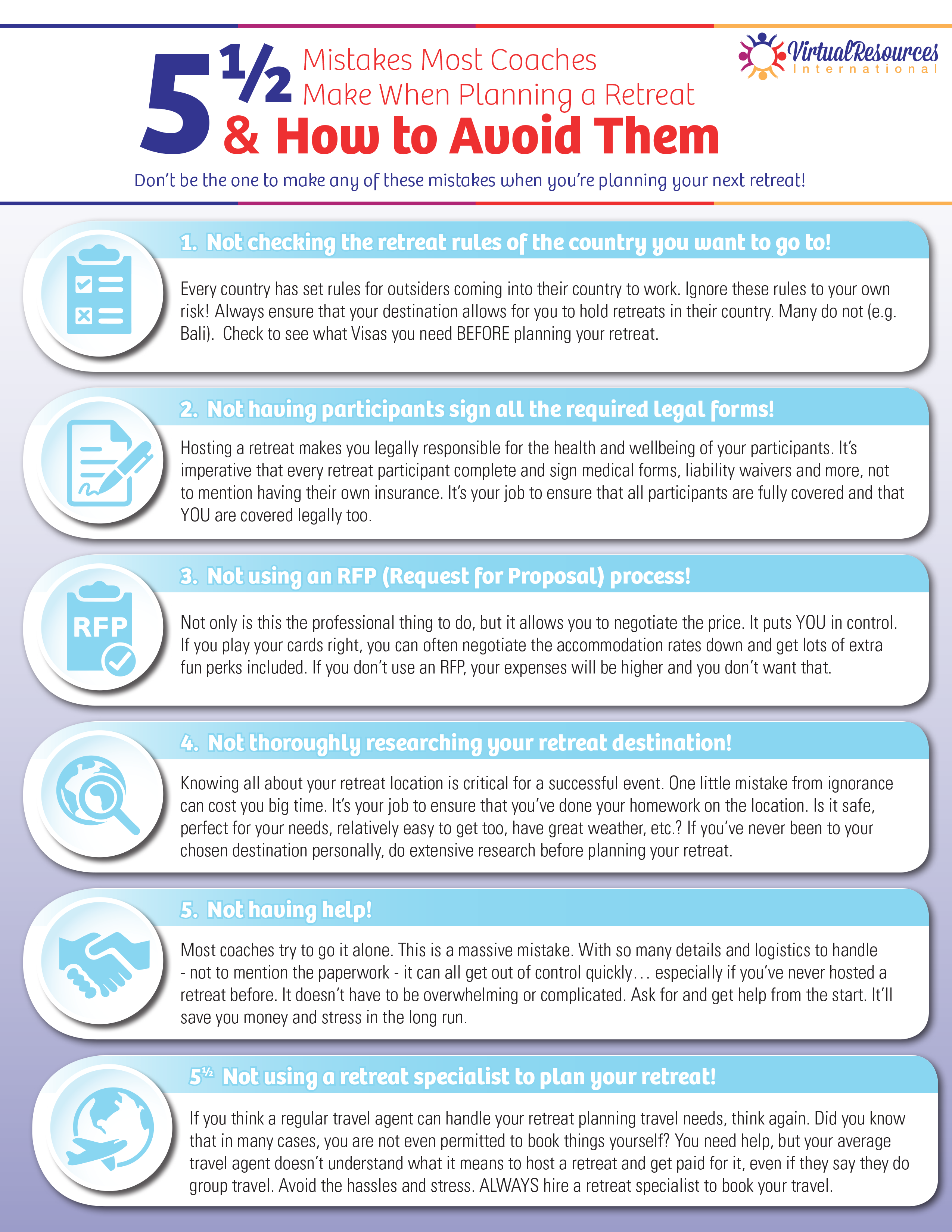
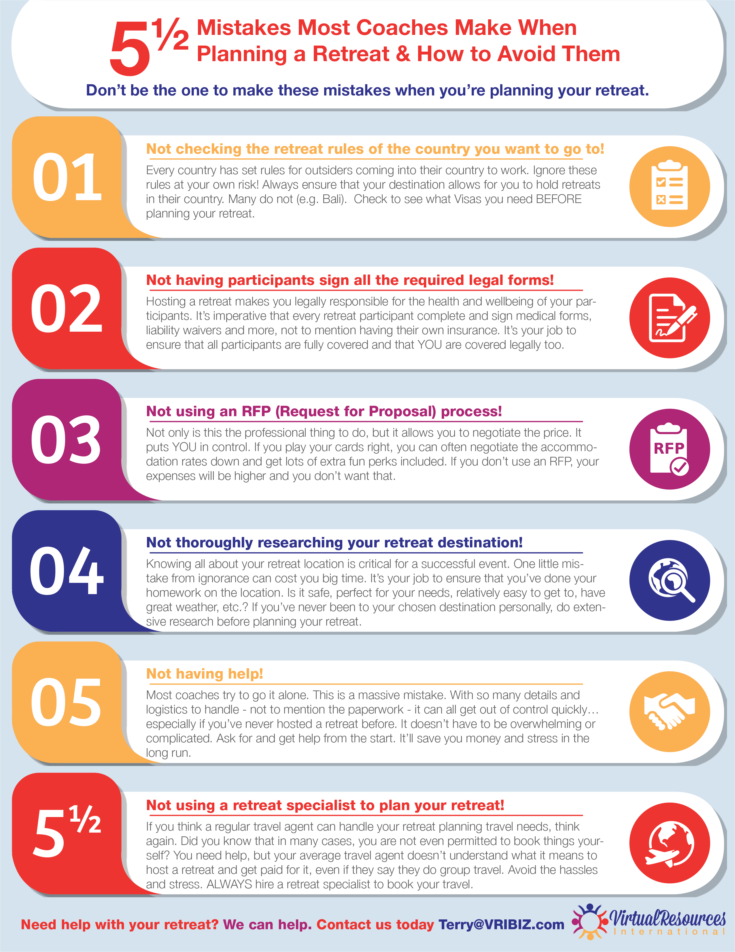
Later on she wanted me to do a fancy handout about common mistakes people make when planning retreats. I initially went for something featuring lots of cute little icons with a prominent light blue color scheme.
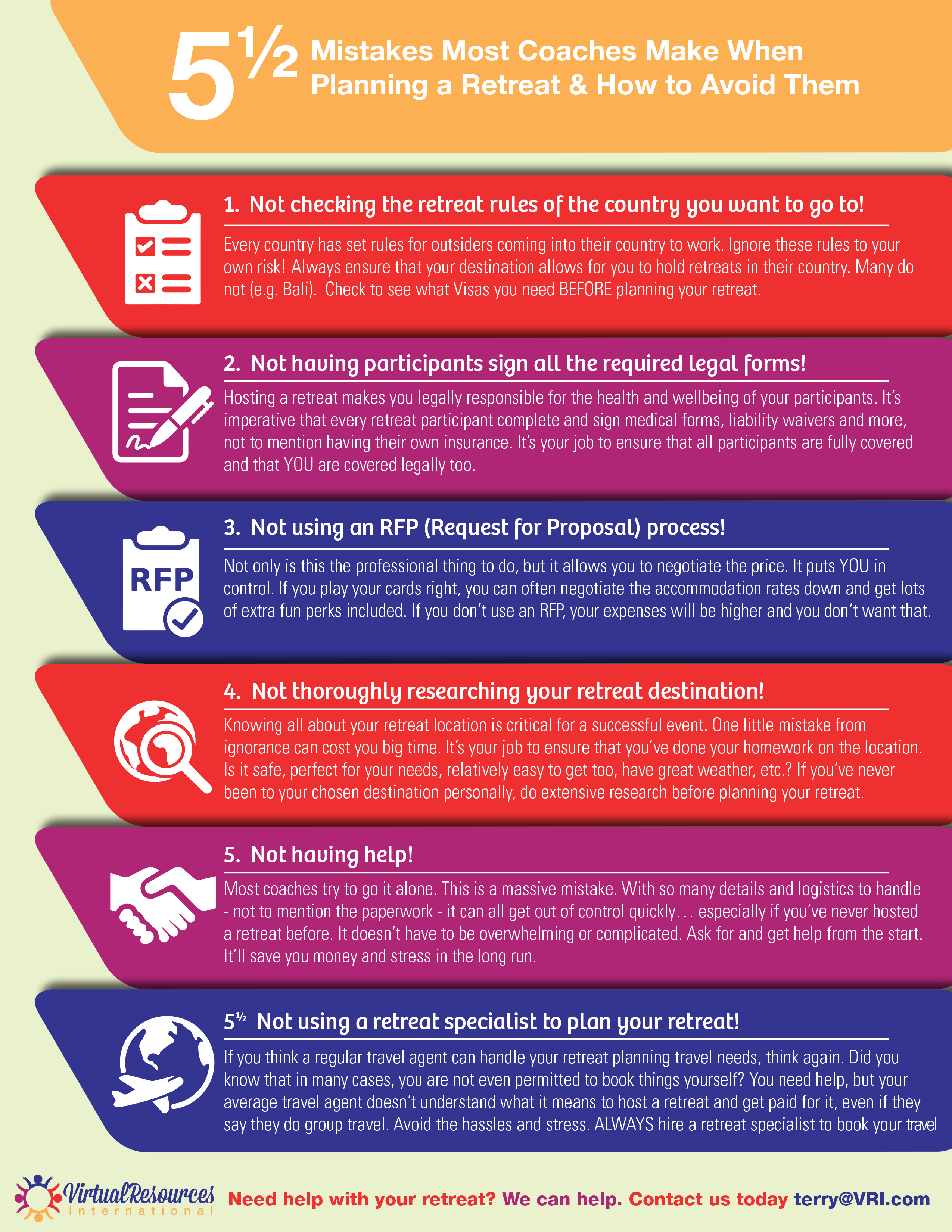
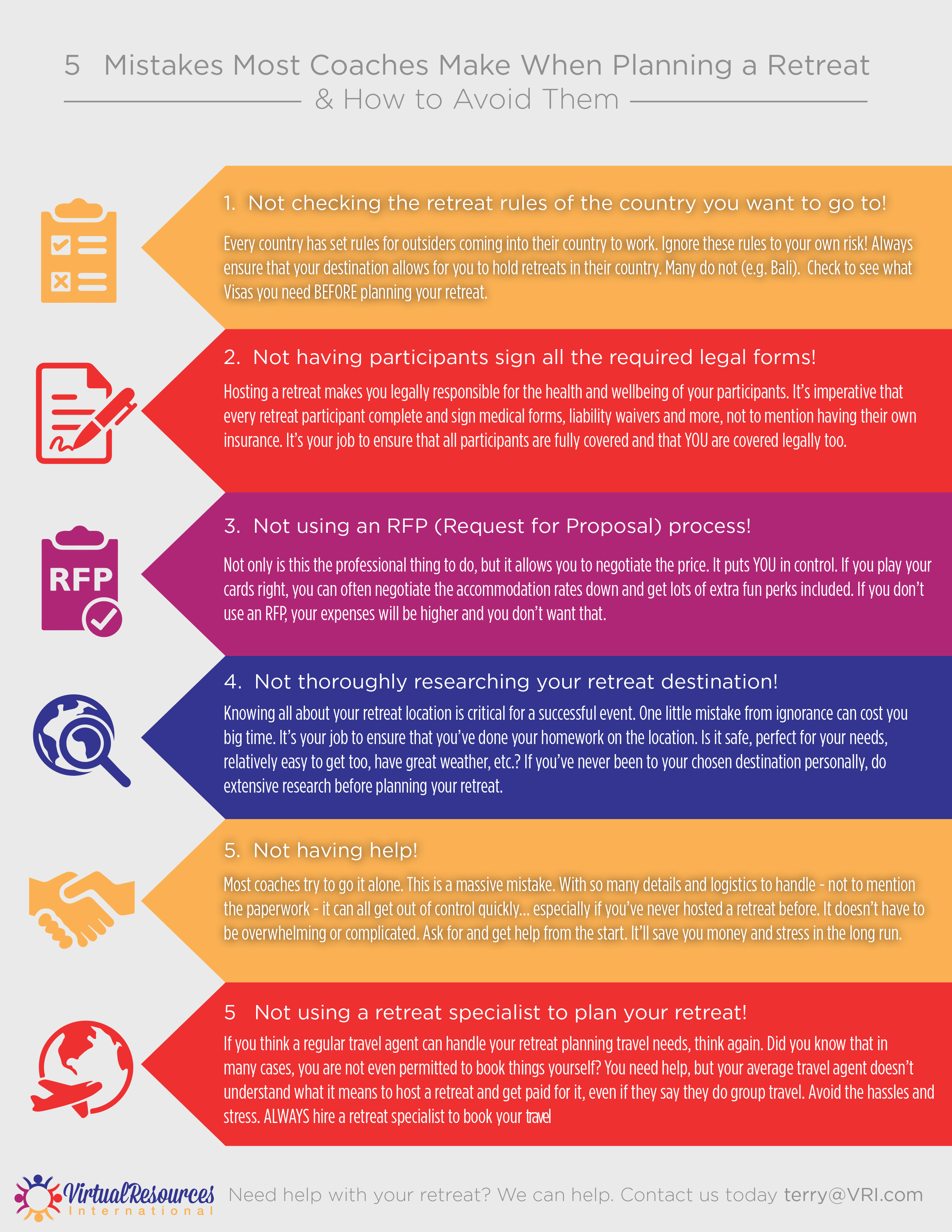
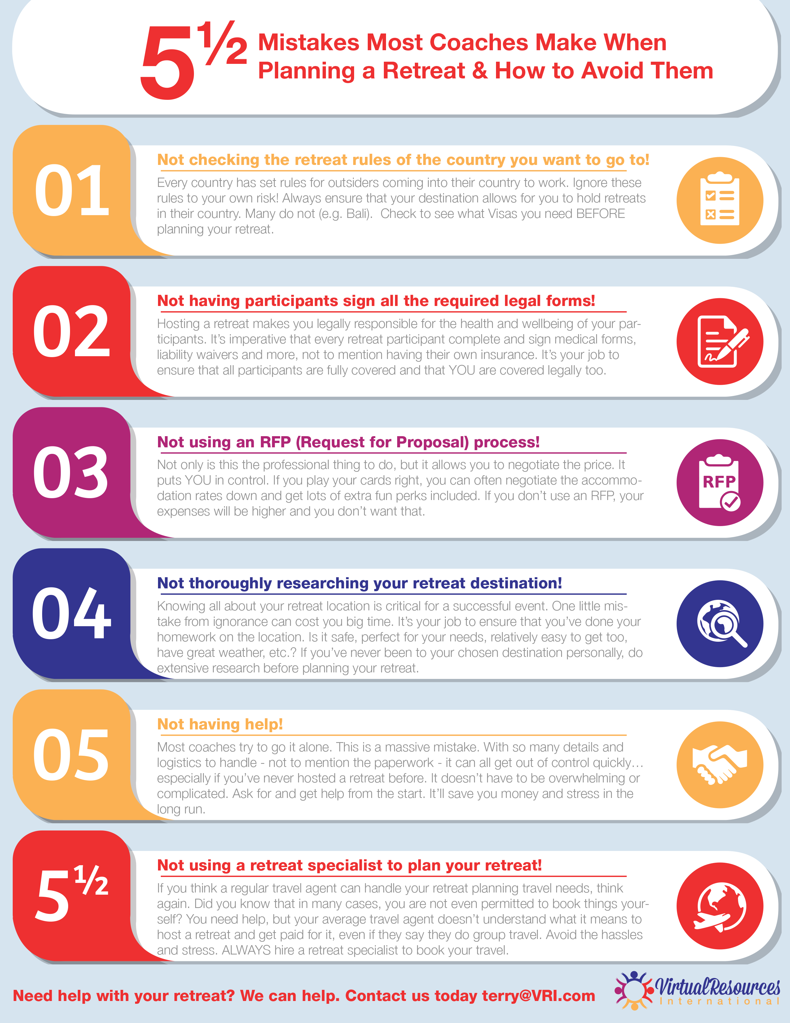
They weren't keen on this one though and wanted some other options, I then created 3 distinct looks, I incorporated more of the company colors and tried to make them pop more.
They liked the third version and after some tweaking and text manouvering, they settled on the below design.
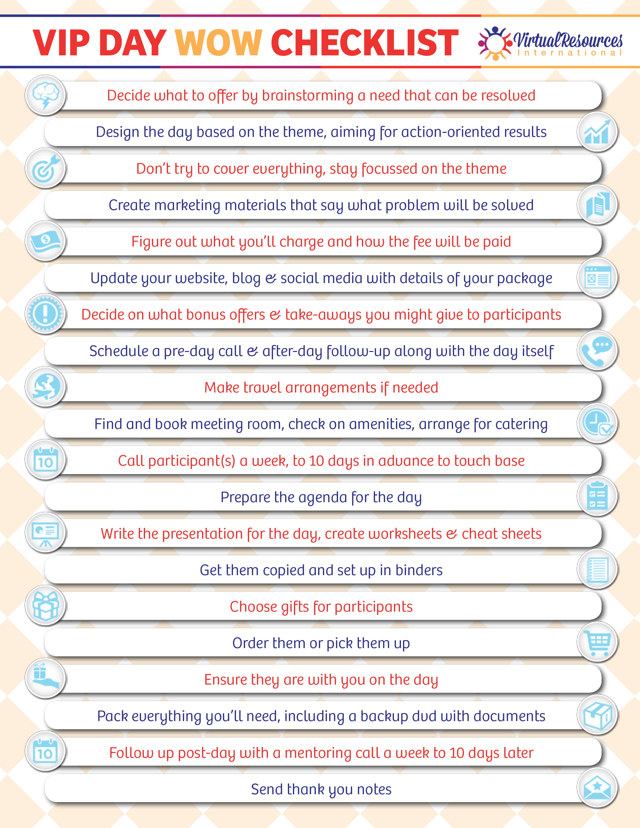
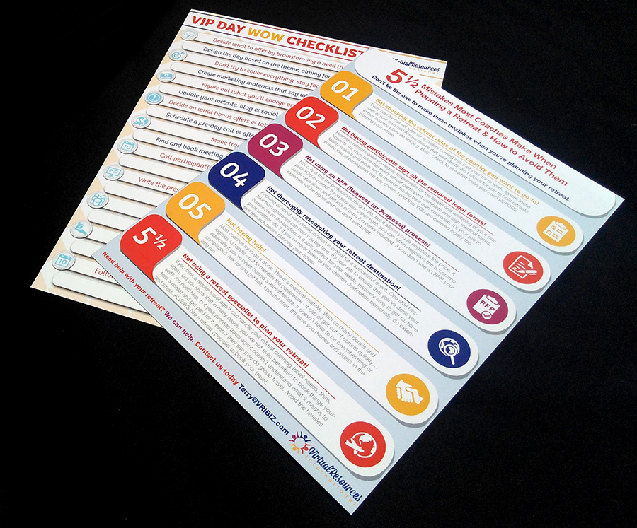
Later on she wanted a larger checklist, this one was a bit of a challenge because of the spacial constraints and sheer volume of text included. I didn't have a ton of room for graphical elements.
Later on they wanted another printed item, a checklist. I decided for this one I'd go for a cute checkered background. This design went through with relatively few revisions.
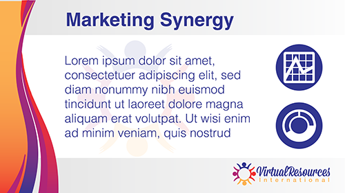
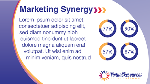
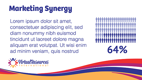
Later on they wanted me to design a powerpoint layout for presentations. Doing design work that results in client end manipulation is always a little odd because in some ways it feels a little like I'm training them how to use whatever program I'm designing the item in.
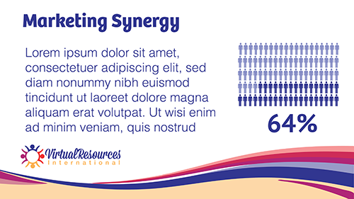
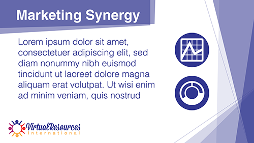
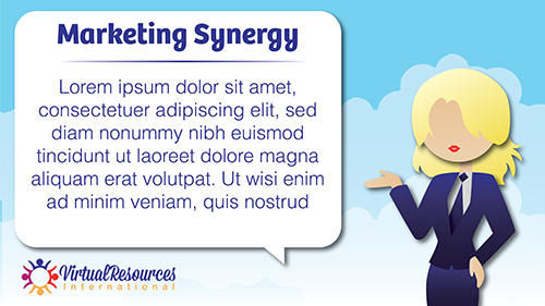
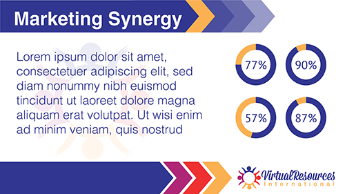
I thought for sure the cute one with the character from the Facebook tiles would go through, but they actually rejected all of them! So I had to take a look and put together another four options!
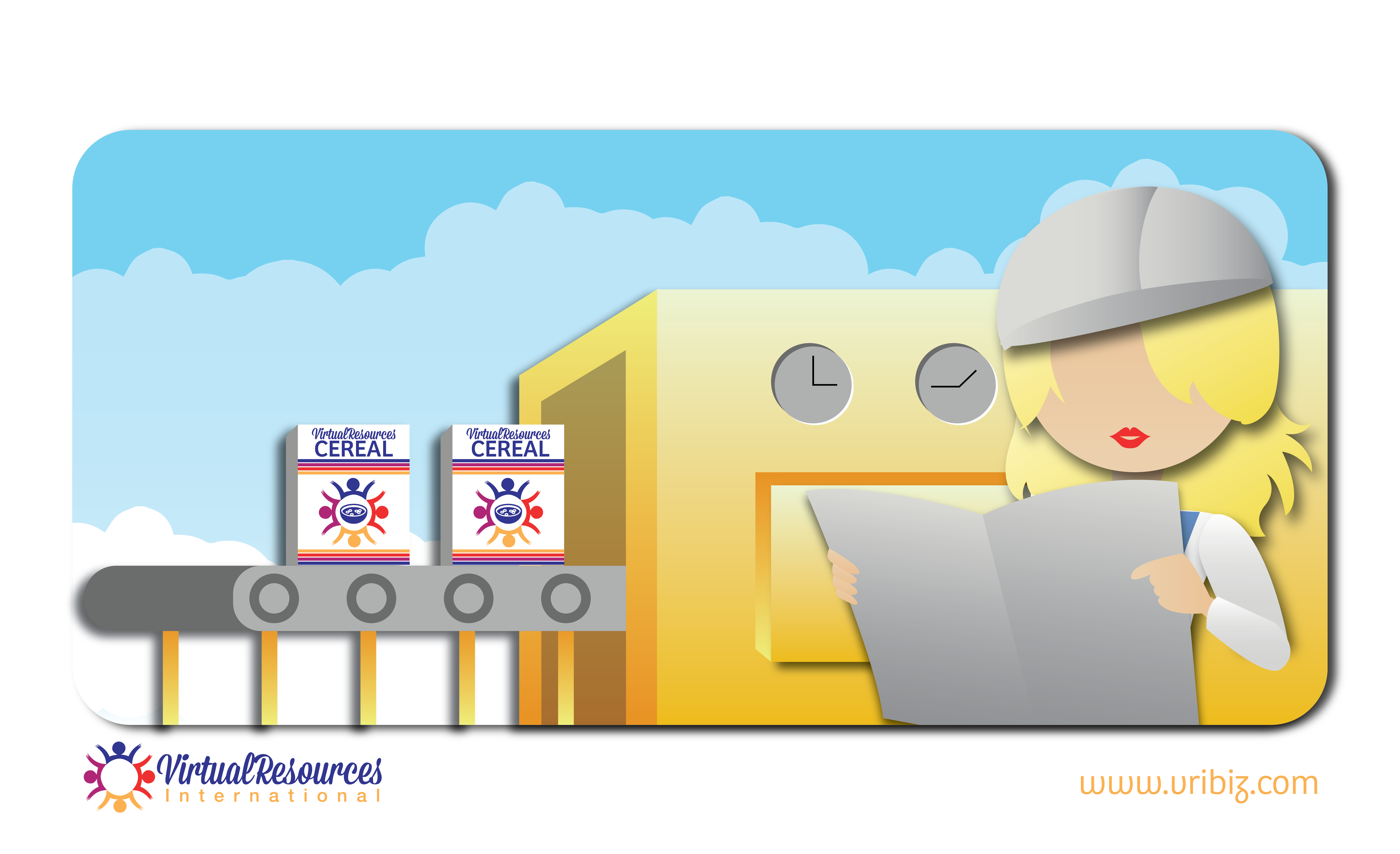
The next, and arguably largest thing I did for them was create images to accompany their blog entries. I'd get an article, read through it and think of 3-4 places where an image would help illustrate the theme and put them together. I derived the aesthetics from the initial Facebook tiles, and ended up creating a cute cast of reoccurring characters. By the end of the blog, I had done over 72 distinct and cute tiles! Below are a few of my favorites.
"Building your business"

"Smorganized"
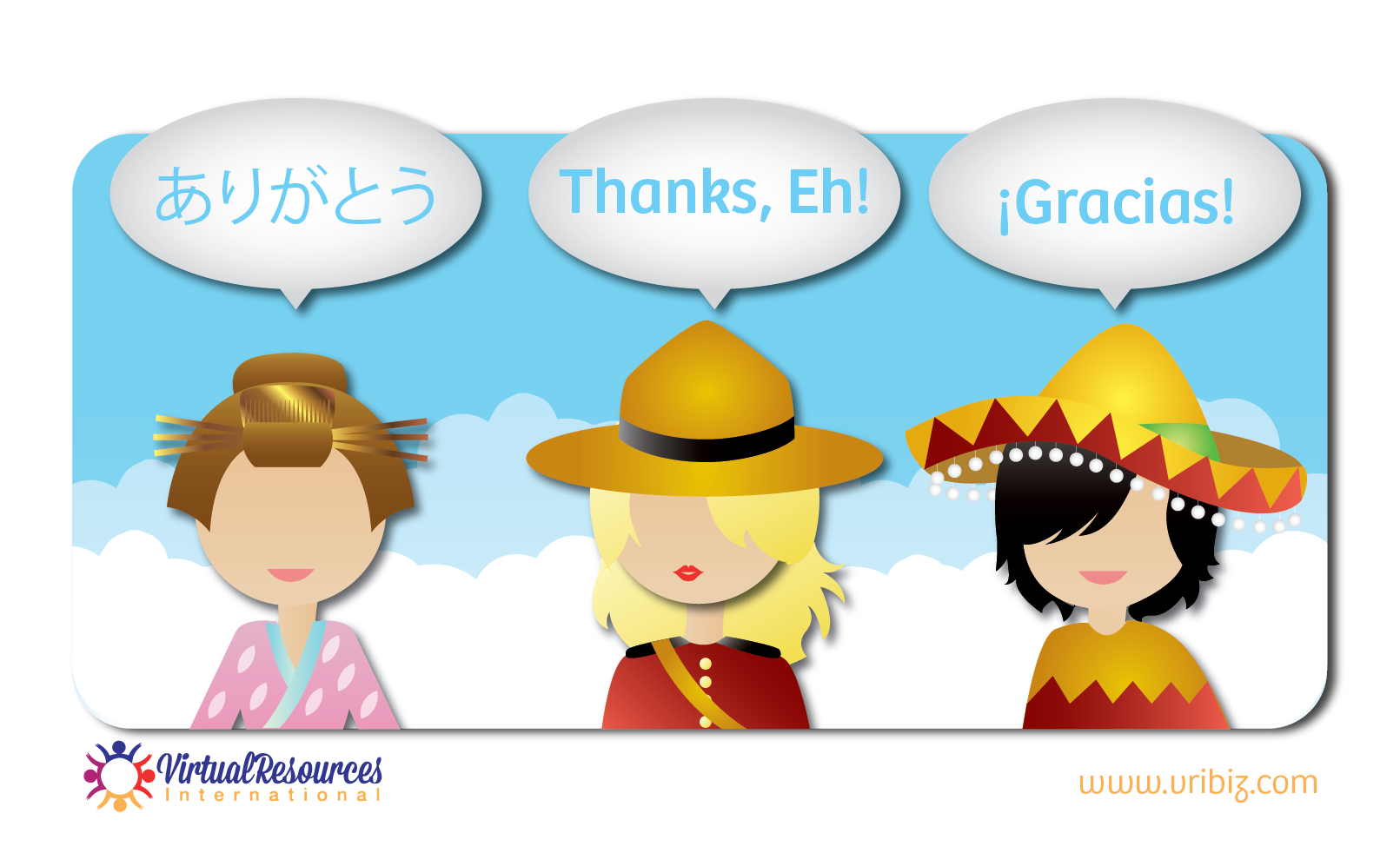
"Saying Hello"
Reflection & Client Reaction
Overall I enjoyed my time with VRI, I got to excersize a lot of different skills with them and really got to be creative, especially with the blog tiles, sadly the company decided to go in a different aesthetic direction and I ended up no longer producing things for them.