 View Full Set
Purchase on Etsy
View Full Set
Purchase on Etsy

Concept
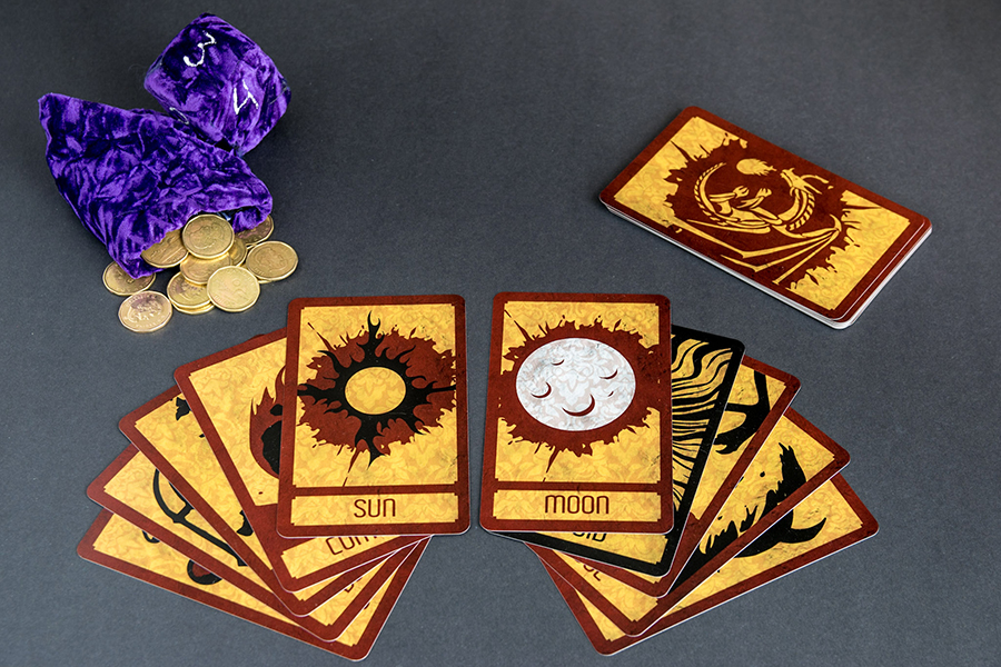
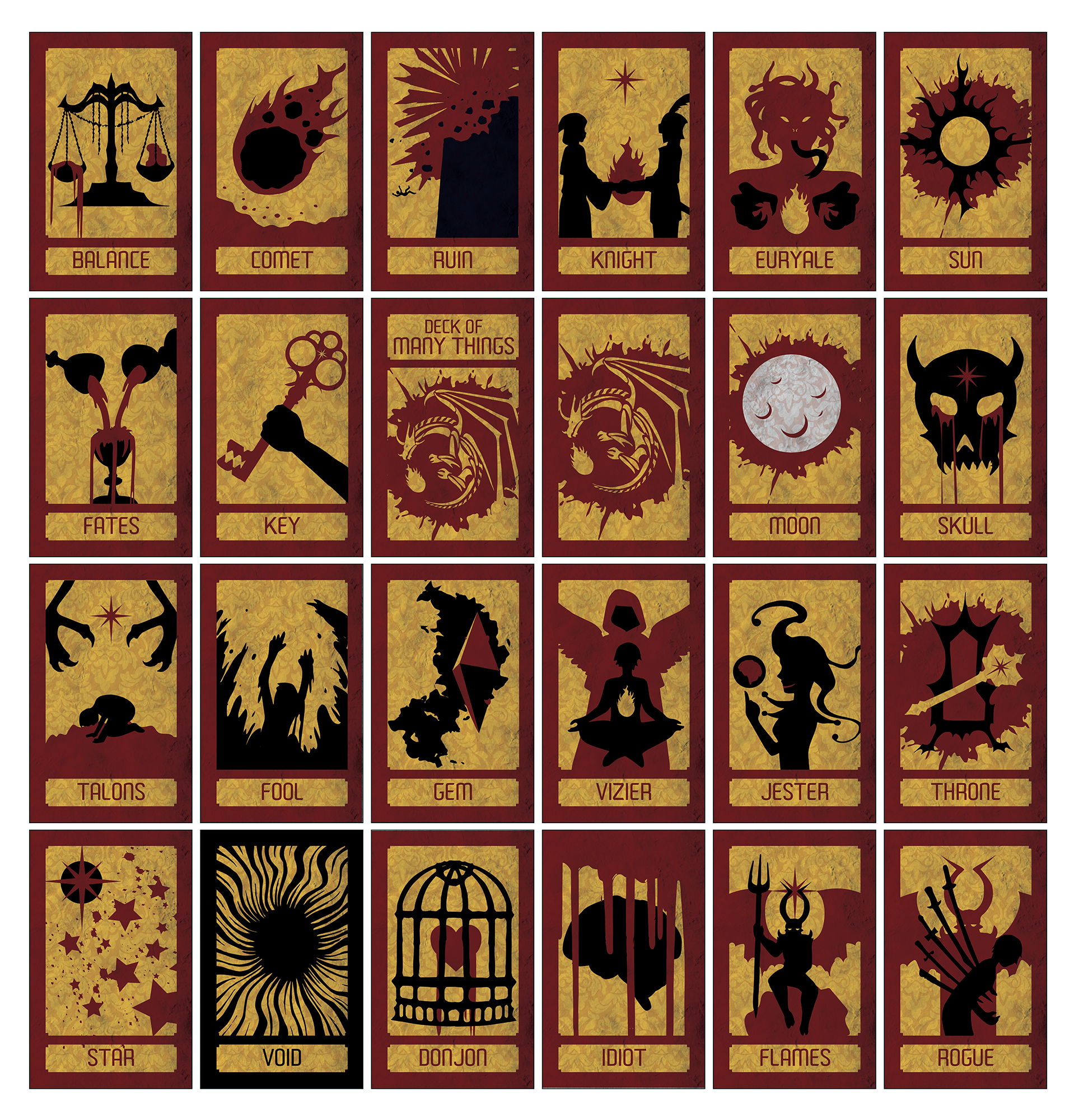
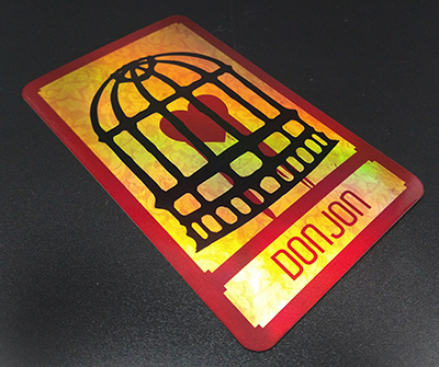
It was just after Christmas, and I was in the process of finishing a long Dungeons and Dragons campaign, and was reflecting on the notable experiences. One of which was the Deck of Many Things. It's infamous in role-playing circles. It consists of 22 cards, each of which has a different effect upon being drawn. I decided that this would be an interesting project, since at the time there was no proprietary representation. However, as always I required a twist, I decided to challenge myself to try a limited color palette, adopting the mantra 'less is more' and sporting simple but powerful imagery over more detailed but less striking images.
Method
As usual, I started every card with a rough sketch of what I wanted the thing to look like. Some went through many revisions while others simply worked right away. I knew I wanted the deck to have a pseudo modern look, and sought to achieve this by using vectors. I broke the images down into pieces and inked them, afterwards, I scanned the sheet and used InDesign's live trace to smooth out the artwork. I reconstructed the images in InDesign, tweaking colors as needed. I also chose an appropriate pattern and a texture overlay to make the artwork look less plain.
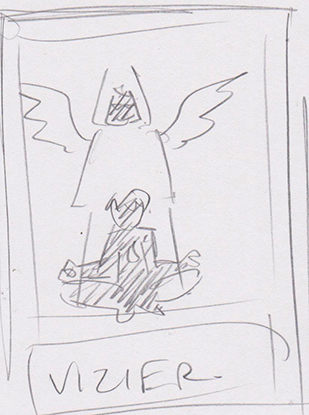 sketch concept
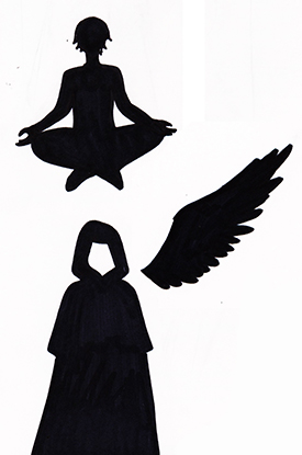 vectorizing sketches
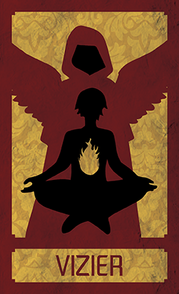 combination of images in indesign
One of the challenges with the project was simplicity. I knew at the outset I wanted a trichromatic scheme. However, I wanted the moon to be special. In-game it grants wishes, so to show its unique properties, I gave it a ‘spot color' of white. The void card causes effective player death, so I opted to knock out the color red and give it a simple black design to make the card look more sinister.
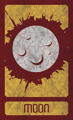 The 'Moon' Card featuring white
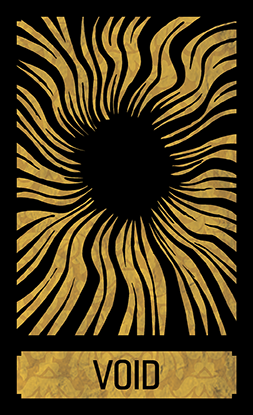 the 'Void' Card, deprived of color
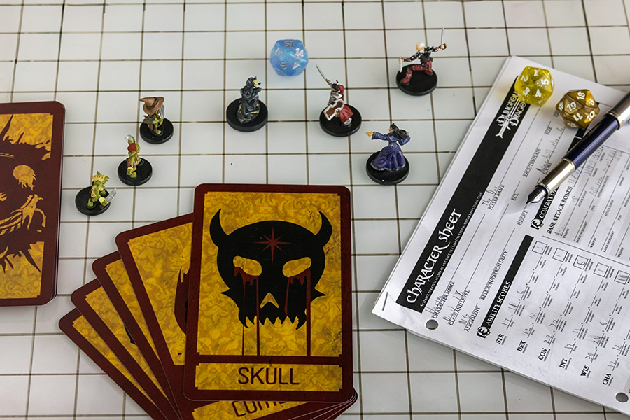
At first the deck was printed with a plain white box, however after Critical Role featured the deck on their show (to my complete suprise) demand for the deck skyrocketed. I upgraded to a custom box as well, experimenting with spot UV.
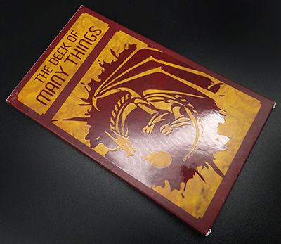
I also got a ton of requests to make foil version of the deck, which after working out some issues, I eventually did. Also as I began to produce more decks, I was able to experiment with different types of cardstock. I eventually settled on this nice linen texture.
 Foil Cardstock
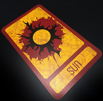 Non-Foil Cardstock
Reflection
I am pretty pleased with how this came out. The design feels professional, clean, and effective. It was pretty easy to actually put together after I figured out what image would be; the hardest part was be nailing down the imagery for some of the more abstract concepts. But after that hurdle the project kind of just fell together nicely.
 View Full Set
Purchase on Etsy
View Full Set
Purchase on Etsy