 White Suit
Blue Suit
| Black Suit
| Red Suit
| Green Suit
White Suit
Blue Suit
| Black Suit
| Red Suit
| Green Suit

Concept
One of the first projects I worked on with Face to Face was for their Candiana Critters Project. This is a very cool project that has Canadian artists draw Face to Face's mascot characters in various art styles for their token series. While I haven't done a lot in the playing card style, I was excited to explore the space.
Method
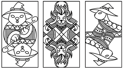
My task was to draw them in a playing card style, since that's something I've done a lot of. I first started by taking a look at traditional playing cards. Notably I've done a few playing card-style Magic characters as various promotional items for conferences.
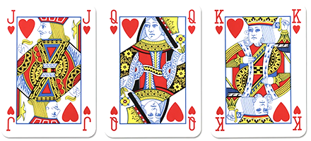 Traditional playing cards
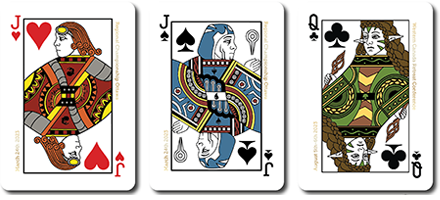 My previous work in the playing card space
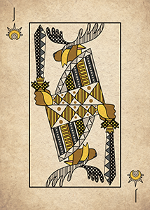
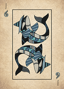
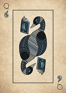
I focused in on the very geometric nature and patterned look of playing cards. I also noted that the traditional cards had a bounding box that allowed the design to run off the side a bit. I also noted that the playing cards tended to stick to high contrast primary colors and seemed to use a pretty limited pallete. While most traditional playing cards have a flat white background, I figured With these restrictions I began drawing. After the six were done and two were colored I found I didn't like how... chonky they looked. the thick linework didn't really feel like it fit with the playing card aesthetic, since most playing cards tend to have more delicate line work.
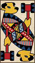
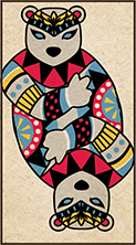
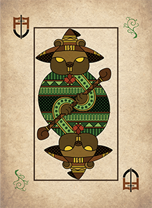
So I hit the drawing board again. I liked the overall form and idea of the old designs, just not the line weight. I used the old ones as a basis and thinned out the strokes. I did notice that as I did that I felt the need to add more detail in, since I now had more empty space. I found myself re-using some patterns a lot, so I created a few of them on a separate layer and resolved to simply copy and paste them as needed. When they were all done I noticed that the beaver and the raccoon both felt a little ovoid. I decided to be a little crazier and run some of their patterns off the edge to make them look a bit more dynamic.
 First draft
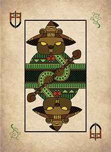 Final
Final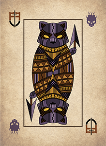 First draft
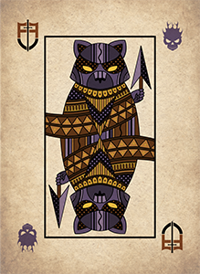 Final
Final
I was also tasked with designing a card back for the set of tokens. The requirements were pretty lax, "make it look good", include the character's name and title and maybe some face to face imagery.
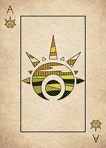
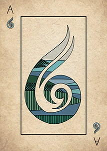
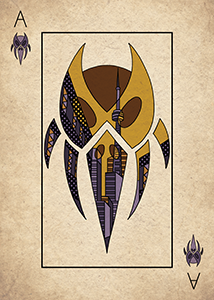
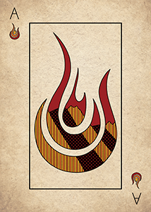
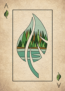
Now initially, this was just a set of six characters for the Canadiana Critters project, but after the initial six were completed, I discussed doing an entire playing card deck as an item for the Face to Face prize wall. I figured it would be something to present to the company once it was mostly done. I sat down and started thinking of what an entire deck would look like. the main issue was that there were six mascot characters, but traditional decks of cards only have four suits. the sixth character could easily be the joker, but the main five characters didn't have any hierarchy to draw on to shunt one of them to joker status. Instead after some humming and hawing I decided that a five suit deck might be the way to go here. the next thing to address was the set symbols. for the one-off run I just re-used some symbols from my art noveau planeswalker playmat, however if this was going to be an entire project I wanted to develop some new unique symbols. I felt the Nouveau ones didn't work particularly well anyways since they didn't have a strong outline like the rest of the imagery. Some of the symbols I felt were fairly strong out of the gate but others were weaker and got completely reworked. I also knew I wanted symbols with a fair amount of interior space since I wanted the Aces to feature the set symbols but with iconography of each of the main critters' domains. The white symbol therefore needed to be redone, and the black symbol I also felt was out of place since it was a human skull, not an animal one.
.png)
.png)
.png)
.png)
.png)
I toyed with the idea of having the design be outside of the symbol on the Aces and having it merely be a prominent part of the scenery but settled on having them feature the locales inside the aces with the same pattered aesthetic as the creatures. I'm still not totally sold on this, but I'm overall happy with how it came out.
The next thing was to hammer down the animals, this was by far the most difficult part. The iconic critters would of course, occupy the king slot, but what would their supporting cast look like? They needed to be the same class, as the main critter, occupy a similar color space and be from roughly the same area! This was no small feat indeed! The class could be conveyed by clothing and the like, so I wasn't as worried about that, but the color scheme and locale was tougher. I also wanted them to be iconically canadian. It wouldn't do to have some critter that isn't natively Canadian. (The mountain lion design is already pushing it a bit). A few things were obvious, the canadian goose, the killer whale and the moose all needed a slot. At one point a grizzly bear was on the docket but that looked too visually similar to the polar bear (especially since I had it slotted under green, so it would be druidic in nature, which is very visually similar to a mystic.) The goose was brown and white and felt more effeminate than a lot of the other creatures, so I slotted it in between the ox and moose in white. While it isn't really a plains creature some sacrifices had to be made. the killer whale easily slots under blue and got a little wizard hat for its efforts. the third animal in blue ended up being a loon, as is featured on our one dollar piece (affectionately called a loonie).
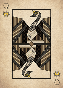
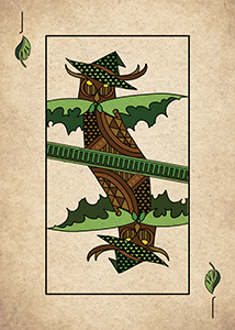
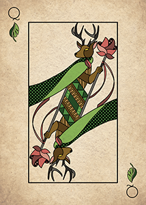
Green was a bit harder, woodlands and western canada were my themes. I wanted an owl as a bit of an homage to judges, also I figured it was a good fit for the druid class. that being said in retrospect I'm not a huge fan of the cloak and kind of wish I'd had him spread his wings instead. the queen was difficult and I wanted some kind of antlered herbivore. I thought of a deer or elk but the issue there is that the females don't have horns. However, female caribou do! since nothing says "canadian forest" like an antlered quadruped.
The final task in this project was to modify the previous card back to fit with the new aesthetic and to remove the animal name from the backs as well.
Reflection
Overall I had a great time doing this project, the designs are weird and strange and kind of let me put something unusual out into the world, which is where I generally like to be. I'm excited to see them in print!