Greyhaven Bird Santuary Website
Project Completion Date: January 05, 2026
 Visit the Site

Concept
The original website felt inconsistent and a bit neglected. Different pages used different fonts, colors didn't quite match, banners were low resolution, and overall it was just difficult to naviate. When I was going through my own adoption process, not only was it difficult to find the birds currently up for adoption, but when I finally found one I wanted to meet, apperantly she was no longer at the shelter. Intially I offered to simply keep their available birds up to date, but when I got access to their Wordpress site I saw that there was much more that could be done. After confirming a bit of a redesign would be okay, I set to work. My goal was to clean it up and make it feel cohesive and modern, without completely rebuilding it from scratch. Since it runs on WordPress, I was working within some pretty rigid constraints. So my previous project with WordPress was the
Judge Foundry website, which was a learning curve in and of itself (up until now all my sites have been written in Notepad using HTML and CSS). Wordpress is great for people that don't want to deal with code, but can be a nightmare for those that do because there's often so much hidden formatting that is either inaccessible or in some obscure menu somewhere. To make things even more complicatd, Greyhaven's wesbite runs on WP Bakery, whereas Judge Foundry used Spectra, so that posed even more challenges!
Method
When doing a bit of a redesign, it's always good to start with the logo. The logo on the old website is fine, but looked a little dated. Luckily crawling their facebook page revealed that they actually had a new version of their logo all ready to go!

Old Logo
Newer Version of their logo
the issue with the new logo that while clean, it was round which made the text very tiny when placed in the upper right hand corner of the website. Luckily, I'm a graphic designer, so changing logos from vertical to horizontal is well within my skillset. however to do this I had to rebuild it from scratch as a vector since I couldn't find a high resolution version of it anywhere. While I was rebuilding the logo, I smoothed out the feathers on the back of the macaws head. while the logo is already quite beautiful I think the smoothed feathers make it a bit cleaner overall. When I posted about some of the website updates and the new logo in the volunteer facebook group, they even asked me for an updated version of the round logo with bolder text!

New version for the website

updated round logo
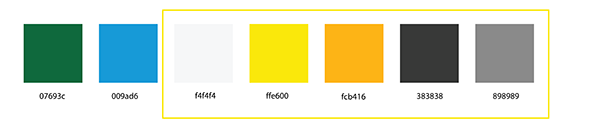
From there I built myself a spread of "acceptable colors" to use across the website. There were a whole cavalcade of different yellows, blues, greens and greys being used all over the place and it looked like a bit of a patchwork mess. The first step in making something look professional is a consistent palette across the entire website. Notably I stayed away from the green and blue since the website already had enough color with just yellow and grey.
Brand Colors
From there, a lot of my work was about consistency. I standardized fonts, spacing, headers and dividing lines. I applied the new color palette, and made sure those choices were applied across every page. Content-wise, I reworded a lot of the pages to make them clearer and more readable. Some of the original text had grammatical issues or carried an inconsistent tone, so I focused on making it feel more natural without losing the intent.
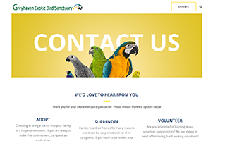
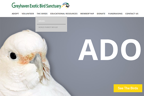
The next large job was the banners, I liked the style of the old banners (big text, big colors, big birds) the main issue is that they were built with smaller screens in mind, so on most monitors they'd appear low resolution. It was also inconsistent how and when they were applied. some pages lacked the large hero banners and on others they didn't span the width of the page.
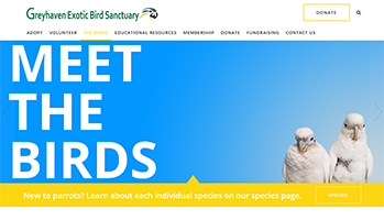
page spanning banner
doesn't span the page
No banner!
I scoured the images in the website and dug up some cute bird photos and got to work. I liked the gradients but felt the old ones were a bit flat. I used colors from the photo of birds that to make up the banner color and also gave it a subtle leaf/feather texture. I also applied a bit of a dropshadow to all the elements to make them pop a bit more. A few of the images I had to upscale a bit to have them be large enough for the banners.
old banner
new banner
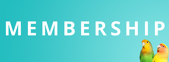
Aside from all the systemic stuff there was also just a lot of one-off weirdness that comes with multiple users making piecemeal changes. on the old homepage you can see that the word membership is partially obscured. that's some triangular element that was rather difficult to track down and eliminate. a few similar layout oddities were removed from other pages.
Something is blocking some letters in "membership"!
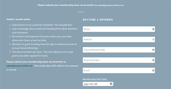
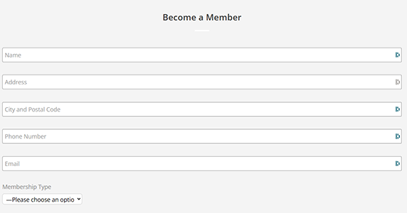
I'd say the sign up forms were another big overhaul, the old ones were quite dark, inconsistent between the three or four and many of the fields needed to be changed or updated.
old form
new form
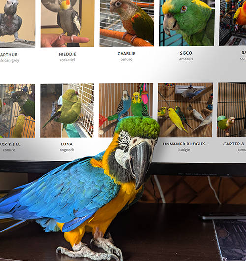
Finally we come to the part that was my initial impetus for wanting to take on the project. The bird bio pages. The sanctuary is quite far from me (about a 5 hour drive, which is why I opted for online volunteering rather than in person.) However I was making a trip to the area for other reasons, so I swung by the shelter and took inventory of all the large birds. I also got a non negligible amount of bird cuddles while I was there!
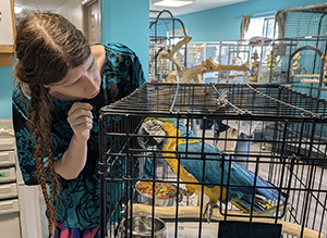
look at this cute lil guy!
Next was getting them all up on the website which wasn't too difficult, until I realized that some of the birds had longer names than others, which would cause their row to become misaligned. I ended up overriding Wordpress' formatting with some CSS. Similarly, the mouseover effect had two small icons appear, one to look at a larger version of the photo, and the other to actually go to the bird's bio. I just wanted a single click to take the user to the bio, and not require them to target a small icon, but there wasn't a native way to to this so that was also overidden with CSS. They seemed happy with the website overhaul, since later they got me to design a banner for their outdoor stand.
Outdoor Fabric Banner Design
Reflection
This project was less about flashy design and more about problem-solving within constraints. WordPress made certain things harder than they needed to be, and a lot of the work ended up being small fixes that add up rather than one big transformation. That said, the site feels significantly more cohesive now. The visuals are cleaner, the content is clearer, and the bird pages in particular feel much more complete and intentional. At this point, the project has shifted into maintenance mode. I regularly update the bird listings, and make minor tweaks as needed. Overall I was really happy with this project and was grateful of the amount of freedome Greyhaven gave me with it.