 Visit the Site

Concept
Before we really dive into it, I should probably provide a little background on what Judge Foundry is. When Wizards of the Coast shut down their official Magic: The Gathering judge program, leaders from that program across the United States and Canada came together to build something new. An organization run by judges, focused on maintaining certification, supporting events, and keeping the community intact.
I was elected to the board of directors during the program's second year of operation, and was re-elected in the third year as well. I initially joined with the intention of contributing to products, design, and branding, but the role quickly expanded into a much broader mix of responsibilities across design, operations, and organizational infrastructure.
When I first got involved, a lot of things existed in isolation. Branding wasn't especially cohesive, processes weren't always well-documented, and some systems were either underused or difficult to maintain. My goal became less about any one deliverable and more about improving clarity, consistency, and reliability across the board.
That meant everything from visual identity to backend logistics to just… making sure things didn't fall apart.
Design Work
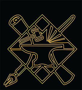
I started with the Judge Foundry logo. The central theme was always going to be the anvil, from there I played with fire, different implements striking the anvil, and various types and styles of anvils. I also experimented with a lot of different typefaces as well. Orange was always a strong contender for colors, and the gradient was an immediate hit. I experimented with by complimenting it with teal, but that made the logo very similar to some large tournament organizers, and we didn't want to step on anyones toes. There was quite a bit of back and forth with a lot of design concepts.
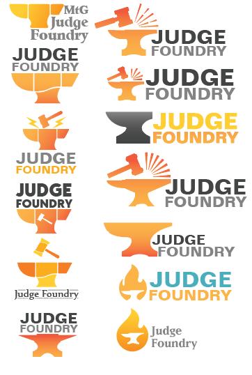 Logo drafts
In the end we went with a strong bold typeface, with a gavel striking the anvil, and five uneven sparks flying off, to represent the five judge levels. The final direction balanced symbolism with readability, keeping the form simple enough to scale while still having a bit of personality.
 Final logo - horizontal
 Final logo - vertical
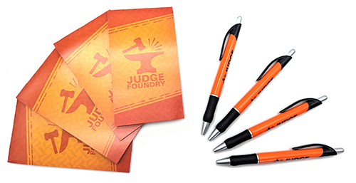
From there, I worked on a variety of print materials. One of the first initiatives I was a part of was designing some advertising and recruitment material that would be included in tournament kits that were shipped to stores all across Canada. The kit included an 8.5" x 11" sheet explaining the benefits of hiring a judge for their tournaments, a window cling to help the store advertise when their event was, as well as a postcard advertising Judge Foundry to prospective judges. It also included a touque for the judge running their event.
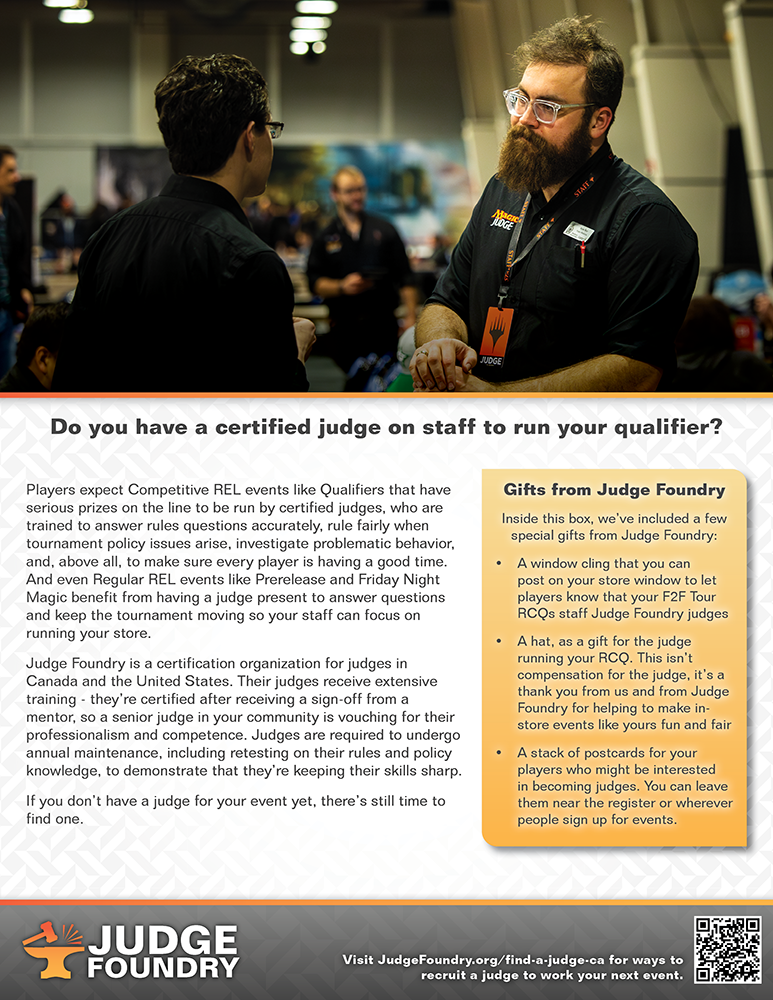 8.5" x 11" sheet
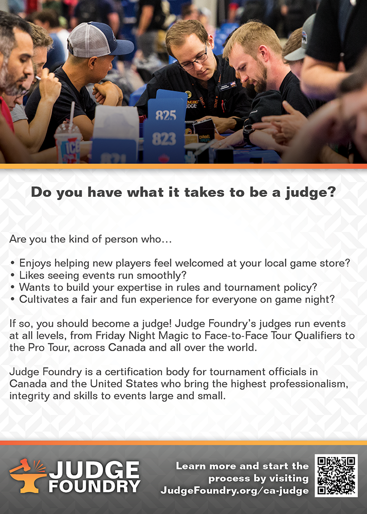 Postcard
 Window cling
I also created a number of physical products for the organization, which was my initial impetus for joining. The notebook was something I keenly enjoyed doing. The front was just a simple branding excersize, but the back was meant to be a judge "quick reference" for valuable tournament information, like draft brackets, how to pair a top 8 and the what number of rounds certain player numbers would merit.
 Notebook front
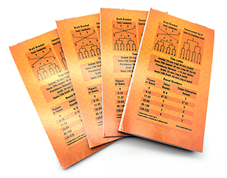 Notebook back
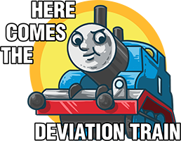
I also designed a sticker sheet for the shop. One of the challenges with the organization was that it often leaned toward a more conservative tone, and I wanted to introduce a bit more fun and levity. The sticker sheet went through many revisions, with several concepts ultimately set aside. Ideas like a playful deviation train sticker inspired by a familiar meme raised concerns around recognizable references, while a missed trigger concept featuring Jace and a “foil enjoyer” design were also reconsidered due to sensitivity around brand depiction and product quality.


In the end, we landed on a finalized sticker sheet that could be enjoyed by everyone. While it took considerable iteration to get there, the process helped ensure the final designs were accessible and appropriate for the organization's audience.
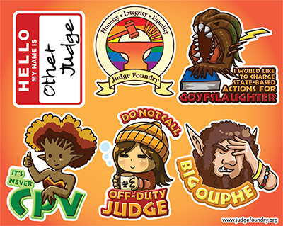
I ended up making a few more stickers in the same style later as a giveaway item, not explicitely tied to Foundry, but as something for judges in general.
 A Judge policy inside joke
 Joke about Mishra's Bauble
Something else I had a hand in desigining was the Judge Foundry blank tokens, these are little cards that can be drawn on to make on-the-fly tokens. On the back has some information about Judge Foundry. I ended up using quite a few of these at Cubecon on coverage when some of the Cubes didn't have tokens!
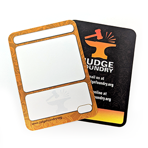 Foundry Tokens
Another one of my more utalitarian pieces of design work for Foundry was a kind of “emergency event kit” with table numbers, draft guides, and time extension slips. Judge Foundry had plans to make custom time extension slips, so I did up some templates for them, however they never ended up getting used for the organization. However at Spotlight Toronto I used the template to make up some bespoke time extension slips for everyone on staff, as well as some crucial Foundry volunteers.
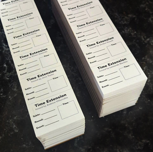 Custom time extension slips
Later on, I worked with the recruitment team to put together a pamphlet for onboarding and outreach. The intent was to create something that could quickly explain Judge Foundry to someone with little to no context. Basically it outlined what judges do, how the program is structured, and how to get involved. One of the main challenges was fitting a fairly dense amount of information into a small, digestible format without it feeling cluttered or overwhelming. I focused on structuring the content in a way that felt clear and guided, using layout and hierarchy to walk the reader through the process step by step, while collaborating with the team to make sure the messaging was accurate and practical.
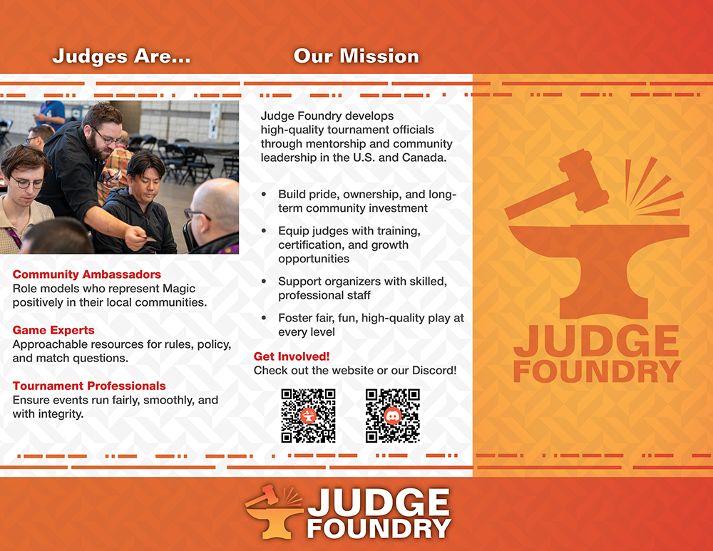 Recruitment Tri-Fold
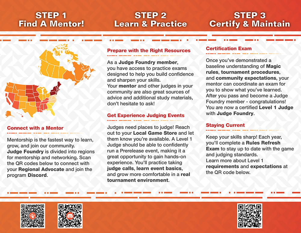 Back of Recruitment Tri-Fold
Something more artistic that I got to work on was the hoodie design for the winner of the annual review contest. We went through a few iterations, initially I was a bit confused and for some reason thought we were doing a pin for the winner of the contest. So I made these two cute pin designs.

However after some clarification, I decided that while the above designs were pretty cool pin designs they likely wouldn't look as good on a hoodie, so I put together a hoodie design that was a little more detailed.
 Review Contest Design
I also worked with the Exemplar Project to create a banner and an icon for them. Exemplar has a long history in the judge program. In the days of an official Wizards run program Exemplar was a system of recognizing other judges for their contributions, and those nominations would usually be tied to official promos and foils. The old Exemplar banner featured the artwork for Serra Angel and the name of the program, including the official Magic judge logo. Obviously we couldn't use that. One of the members of the team showed me their idea for a banner. However, we both knew there was much to be desired on this one.
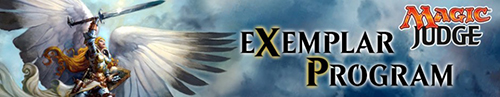 Legacy Exemplar Banner
 Banner Proposal
I noted that they were using the card art from Aurelia, Exemplar of Justice, so I decided to start with that. Notably I had to paint in the remainder of her wing to have it not look awkwardly chopped off. From there I painted in the background and added a the text and Judge Foundry logo.
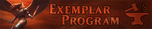 Final Banner
 Icon
Icon
I also designed a Judge Foundry branded playmat, although it never ended up going into production. Finding something to put in the corners was a bit of a challenge, Magic is a game of threes and fives so it's hard to find four of something. Eventually I settled on four animal characters that would represent the four main qualities of a judge: Community (wolf), Excellence (lion), Justice (owl), and Fun (otter). The members seemed to like it, but Foundry couldn't find a good place to use it. Playmats are expensive to print and ship so it wouldn't be a good fit as a shop item, and it had similar issues when being considered for a conference giveaway. So I produced one that wasn't Foundry branded for people to print for personal use. I also ended up using the design in a Face to Face playmat later.
 Judge Foundry Playmat
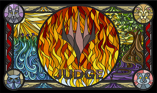 Generic Magic-Branded Version
Treasurer Work
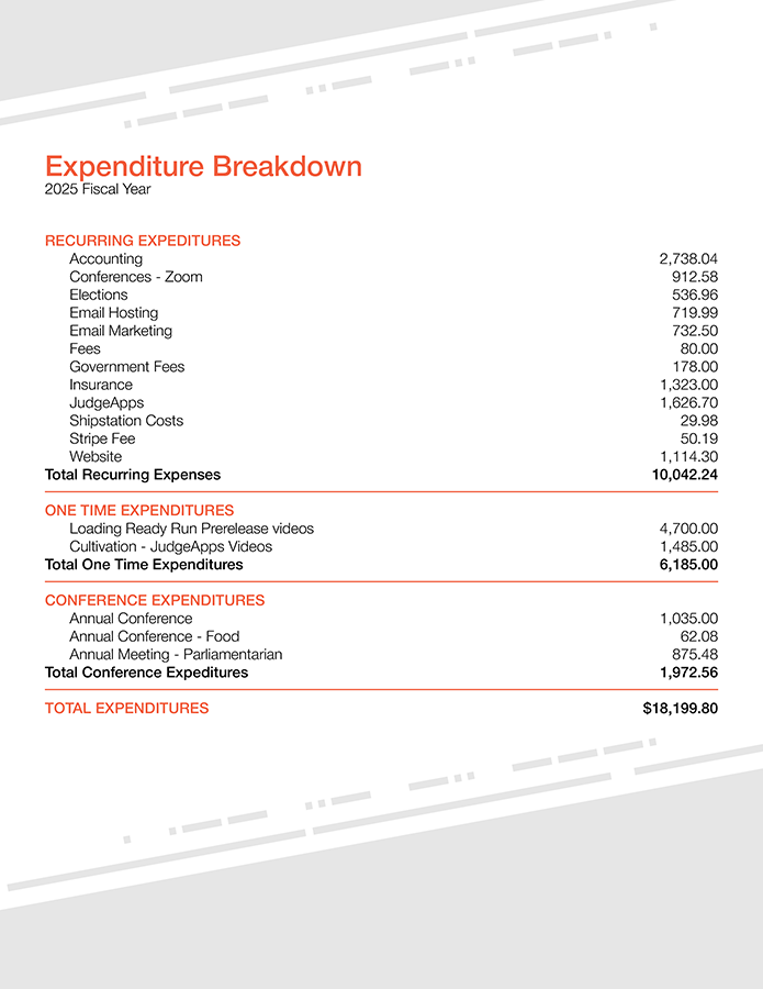
When I took on the Treasurer role, a lot of the work involved organizing and making sense of financial data. I learned how to extract and process WooCommerce data for accounting purposes, including separating business and unrelated business income for tax reporting. I also worked directly with tax professionals for both federal and state filings, which meant making sure the data I provided was actually usable. I handled invoicing and payments with external entities, including creating a usable invoice template. I also managed payments through the organizations bank account as well as subscription and payment issues through Stripe.
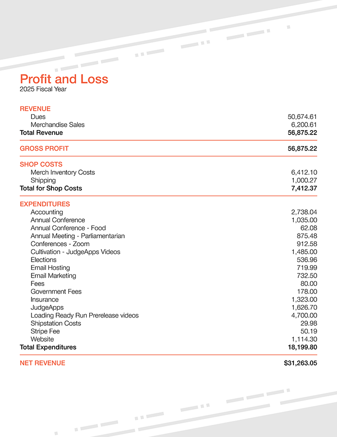
I also had to learn QuickBooks and use it to help track and organize financial information in a way that was actually sustainable. Then I had to process and compile that information each month into a readable report. I also compiled a full report covering both fiscal years to clearly outline operating expenses and revenue.
Website Maintenance
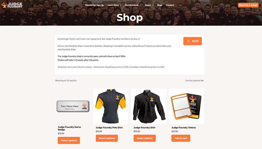
I maintain the Judge Foundry website, which runs on WordPress using Spectra. I had to learn that ecosystem in order to make updates, keep things consistent, and avoid breaking anything. I regularly update the site with things like reports, meeting minutes, and organizational structure changes. Another thing I keep an eye on are the website contact forms, I ensure both that they aren't getting spammed and also triage incoming messages to the relevant parties.
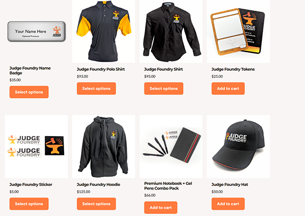
One of the larger jobs is the site's WooCommerce shop, I learned how to set up coupon code for various organizational promotions as well as managing product setup, maintenance, and all associated photography. The photography was one of the larger learning curves for me, I haven't taken appearal photos in front of a white backgdrop before. I tried taking some shots of actual people in the clothing and photoshopping them out, but that resulted in the shots looking very photoshopped. I then decided to get an inflatable torso for the photos. I set it up in my backyard in front of a white sheet and gathered the extra fabric on the shirts in the back with an elastic since the torso was quite small. For the long sleeved items I stuffed the sleeves with other shirts to puff them out a bit so they didn't look so flat. To add a 3D feel I flipped the shirts inside-out and took photos of them on the torso to get shots of the inside of the collar, to give the impression an invisible person was wearing the shirt. The hoodie was particularly difficult, as it was XXL which was far too large for my tiny inflatable torso. I not only put it on the torso but also had to slip a stool underneath to make sure the bottom didn't drag on the floor. The rest of the product shots were easier, I just pulled out the lightbox I use for the rest of my product shots and did them in there.
Other Organizational Work
Some of the most time-consuming work fell outside neat categories. Due to an incomplete credential handover from the previous board, Foundry lost access to many of its critical operational accounts, so one of the biggest jobs was at the start of my second year was to recover those accounts. Some of these accounts were pretty critical like Quickbooks and Mailchimp. Others were less important but still relevant to our operations, such as our Zoom login information, and the login for namebadgesinternational, where we order our custom nametags from. Once we had access to everything we needed, I learned Mailchimp and worked on revitalizing the organization's newsletter, which had largely fallen out of use. I rebuilt the design of the newsletter and another board member took on the task of writing it and mailing it out each month. I also did a massive sweep of spam accounts and eliminated them from our mailing database.
In addition to this I also do some of the administrative work associated with the organization's Google Workspace. Largely that work entails updating email permission and discontinuing deprecated email addresses and groups. I also work with the organization's Discord server, setting up channels, adjusting role permissions, setting up and collapsing roles. I also did a large sweep and condensation of the channels. Finally I also do some work with the JudgeApps website, which is kind of a hub for our members, and keeps records of their levels within the organization as well as functioning as the vehicle for them to take advancement exams. Most of this work is updating member levels and maintaining the level 2 policy advancement exam.
I also do a lot of work communicating with external organizations that we partner with. I've set up meetings wtih Wizards of the Coast as well as various international judge programs to ensure that we maintain not only a North American standard, but a global one as well. Somewhat orthogonal to this was a major restructure and overhaul of the Conference team that I spearheaded as well as a partnership with the JudgeCast Youtube channel to create educational content for our members.
Reflection
This is easily the broadest project I've worked on, and also the hardest to neatly summarize.
A lot of the work is invisible when it's done well. While clean financial reports, functional websites and timely tax filings might not be particularly flashy, but all of it matters. The design work is probably the most visible part, but it's only one piece of a much larger picture.
If there's a throughline, it's adaptability. I had to learn a lot of tools and systems on the fly, often because something needed to be fixed now and there wasn't anyone else to do it.
Looking at everything together, I think I made a meaningful impact, not just in how things look, but in how they function. While there were many points where I was frustrated with the organization and questioned my choice to be a part of it, I think I gained an immense amount of experience and skills during my time here, and feel like I am more well-rounded as a result of that.