 Youtube Channel | Website

Concept
I've worked at large events alongside David Elden in the past, so when he approached me to work on a logo design for his Youtube Channel, I was pretty excited! Over time, the scope of what I worked on for him expanded quite a bit. What started as a logo design, eventually turned into a full brand package: logo design, a website that included a shop, and a series of tokens. Because of that, one of my main goals became keeping everything visually cohesive, even though each piece served a very different purpose.
Method
The first thing I tackled was the logo. I knew it needed to be readable at a variety of sizes, since it would show up everywhere from video thumbnails to website headers to potentially small printed materials. At the same time, I didn’t want it to feel overly corporate or sterile. There’s a tendency with anything "rules-adjacent" to lean too hard into seriousness, which didn’t feel right for them. Luckily Dave was on the same wavelength as me and wanted an animal mascot as his logo, specifically an octopus, because judges are flexible. He knew he wanted the octopus' name to be Inki and it was going to be a cute thing. I love making cute things so I was already excited. I whipped up three drafts, two cute ones and one super artsy one, just to put some variety in there.
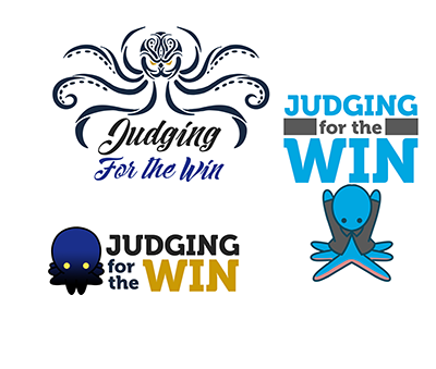 Logo drafts
He liked the cute blue and pink one, so I iterated a bit on that. The color combo was an instant hit, so we didn't change that part of it. He wanted the arms to feel less stiff, also there was a little confusion on how an octopus would wear a judge shirt. Eventually we settled on a shirt with eight sleeves.
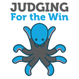 Final Logo
After finalizing the logo Dave wanted a few different versions of Inki, mostly for fun, he didn't have any specific use-cases in mind, but they were trivial to make, and might be useful at some point so I put them together.
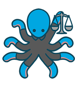 Judgeli
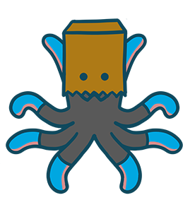 Bagli
Bagli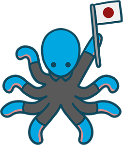 Flagli
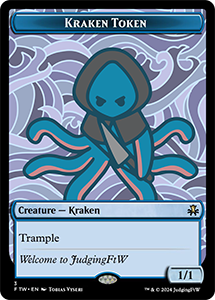
The next thing he asked was that I take the "edgy" logo draft from earlier and make it into a cool playmat. He wanted it as a one-off thing he could use at events and maybe for a channel promotion. I ended up having to revise the original look quite a bit to fit nicely on a playmat. Later on, he also wanted a token in the same style. Originally we were just going to stick the same artwork on a token, but I quickly realized that wasn't going to work, since the aspect ratio was just so dramatically different. So this one also got a bit of a re-draw!
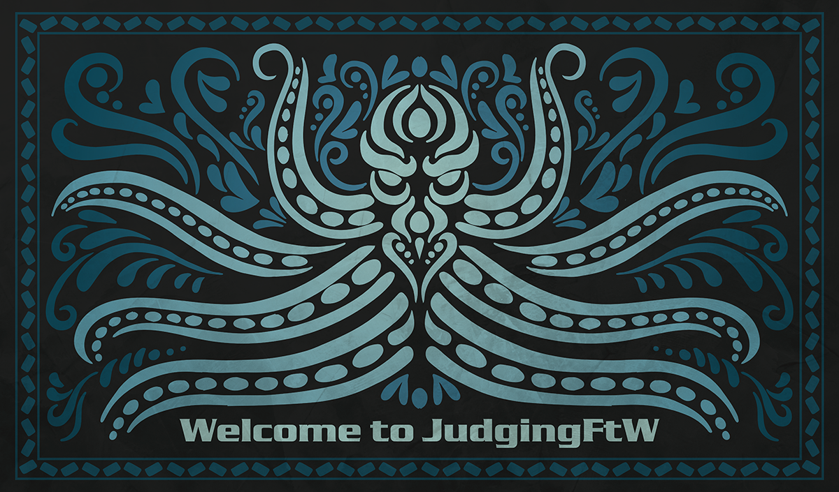 Kraken playmat
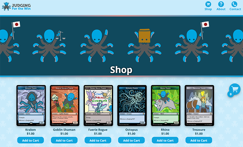
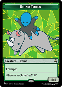
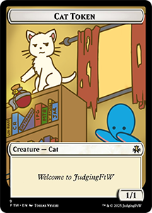
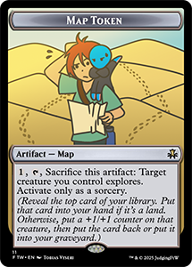
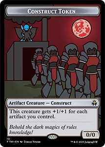
The next big job I did for him was tokens. He wanted these as a promotion to give out at events, the most difficult part was nailing down a style, luckily I had the logo to build off of. A feature of each token was that it would incorporate the mascot character - Inki in some way. Most of the conceptual and creative direction came from Dave. Some clients are very hands-off and basically say "make something that looks cool vaguely associated with X". Some are more like Dave where they have a very precise image of what they want in their mind and just need someone with the technical skills to implement it. Both methods have their benefits and pitfalls. The benefit of working with Dave was that I was confident at the end that he got exactly what he wanted, and I never felt lost or confused about what was required of me. The first batch of tokens was a bit more artistic, I wasn't sure what to do with the background, so I put in an interesting stained-glass pattern. However as the project progressed he had more ideas about what he wanted in the bacgkround so that concept was eventually scrapped.
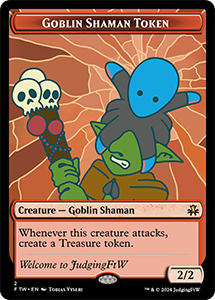
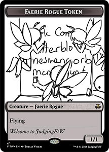
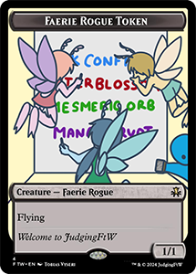
The second set of tokens included this faerie rogue, a channel inside joke about the stack. He also wanted a sketch version of it as a promo token, similar to the Modern Horizons 2 showcase sketch frame.
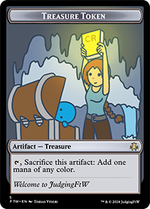
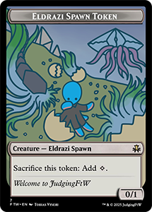
The spawn and treasure tokens were the first tokens where the background really played a part in the artwork. The treasure token was also the first one where I opted into using a gradient effect to really highlight the CR. The orange-haired explorer was modelled to look like Laura Croft to help evoke that explorer vibe. I had a hard time with the hands on this one, and after struggling to find a good reference online I got my partner to model the pose for me.
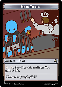
The next few tokens I worked on had much more visual storytelling than the previous ones, the food token featuring Inki escaping from a kitchen at a harsh dutch angle as well as the capricious cat knocking a potion off the shelf. the wayward desert traveller also tells a distinct story, and once again features our orange-haired explorer character.
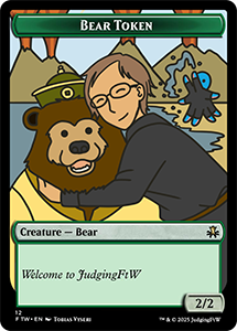
The next set of tokens was less of a set a more of a few one-off ideas. With the release of the Avatar: the Last Airbender Magic set Dave wanted a bear token featuring the Earth King's bear, Bosco, from the show. He said he wanted to be featured on the token with the bear, with Inki in the background doing some waterbending. We agreed on some reference material and I got to work. Boiling people down to their cartoon charicatures is always a bit of a challenge, but I feel like this one came out pretty good. :)
I also worked on the cardback. We wanted it to be reminiscent of the Magic card back, without being legally concerning. I tried a few different color schemes, levels of detail, and overall looks. After a bit of back and forth, we ended up with the final you see below, a nice balance of detail and simplicity, with a fascimile of the familiar brown card back we all know and love.
 draft
draft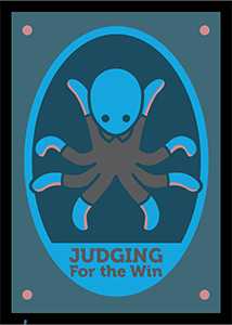 draft
draft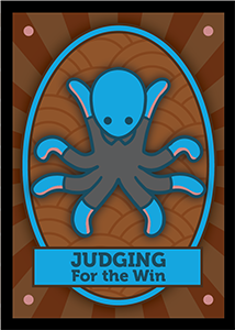 draft
draft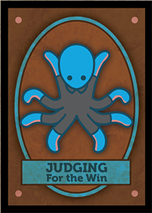 final
final
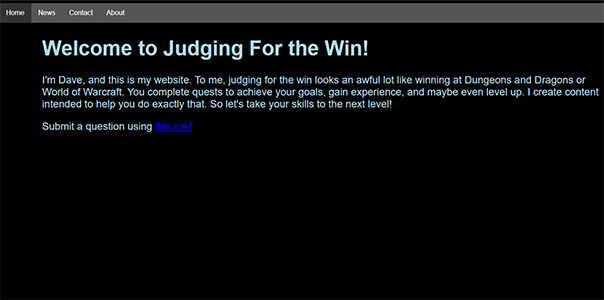
The next thing I worked on for Dave was the website. I accidentally stumbled upon it one day and was immediately concerned. He had mentioned only having the domain so he could have the custom email address. I offered to spruce up the website and put an option for people to buy tokens on it. the payment processor is fairly lightweight, and simply sends money directly to his personal paypal, but that's all he wanted for a smaller-scale operation, like this one.
 old website
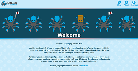 updated website
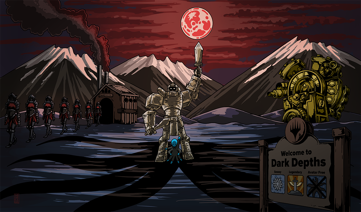
I also made a playmat, this was a bit more involved. A recent rules change caused an interaction between Blood Moon and Urza's Saga to work differently than before and he wanted a token based off of that. Then later he mentioned wanting a playmat that riffed on this idea but also alluded back to the famous destroy the moon scene in Yugioh. This playmat went through a ton of iterations, since it was a higher level of detail than anything else I've worked on for Dave so far. The art style was reworked to be more reminiscent of the Yugioh anime, rather than the cutesy simplistic style of the other tokens. We also included a cute nod to the Millenium Calendar card, since the Millenium items have a huge prominence in the Yugioh lore.
Reflection
Overall, this was a really satisfying project to work on. It was nice to be able to touch so many different parts of a single brand. Compared to some of my other work, this was definitely one of the projects with a wider breadth than most.
I think the strongest part of the project is how cohesive everything ended up feeling. Even though the logo, website, and tokens all serve very different functions, they don't feel disconnected from each other. That said, there were definitely moments where getting everything to line up took more iteration than I expected.
That said, I’m happy with where it landed. It feels like a solid representation of both the brand and the kind of design work I like doing.