 Download the app

Concept
This project was focused on designing the visual feel of a Riftbound judge app. Since I use judge apps a lot myself, especially for quickly referencing rules and card text. I knew that I wanted something clean, organized and visually cohesive. An added complication to the design was the fact that it needed to look official-adjacent without stepping on anyones toes. Since it's developed by a third party, I wanted to play it safe when using official Riftbound and League iconography.
Method
The first job was designing the logo, while I have played Riftbound and watched Arcane, I've only played League of Legends once or twice (I was always a bit more of a dota 2 fan). This meant I needed to do a little research into League's extensive lore to see if there was anything that fellt "judge-adjacent". I found my match in Kayle (not quite the same as a judge but very much speaks to the "law and arbitration" elements) I made a logo that featured a sword similar to Kayle's, but featuring the iconic scales. I used basically the same color pallete as Riftbound, since that would help it feel more adjacent to the IP.
 Logo Design
The app was already pretty clean from the get-go so there wasn't much simplifying and organization that actually needed doing. Quite the opposite actually, it needed a few more frills. The app initially opened on a rather daunting view of the comprehensive rules, without any explanation or preamble. I proposed a titlebar for it, and also revamped the search area, since I found myself having to constantly read the reminder text to realize that was an interactable field. I also eliminated the awkward lines between each rule, and pushed for clearer indentation and bolding standards. Finally I made the text lighter, made the background darker, and added the splashes of orange to help guide the user.
.jpg) Old "home page"
Old "home page"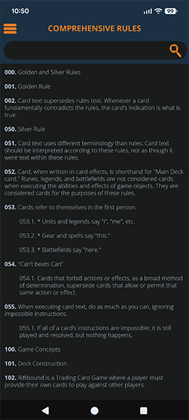 Redesign
I also proposed a system where each major rules section (like Tournament Rules or Comprehensive Rules) would have a top-right menu that opens a structured index. The idea was to allow quick jumps between sections without forcing users to scroll endlessly.
In practice, though, this ran into a major constraint: the Comprehensive Rules are structured in a way that doesn’t cleanly support this system without a lot of manual work. So the feature ended up being more viable for Tournament Rules, which honestly aligns better with how I (and most judges) actually use these apps anyway.
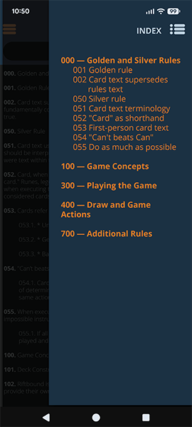 Right Menu
With the card text search, initially they all blurred together. Additionally, sometimes card descriptors would include irrelevant fields. I proposed a new one that highlighted the names more cleanly as well as removing irrelevant fields and added an option to see a card image.
.jpg) old card menu
old card menu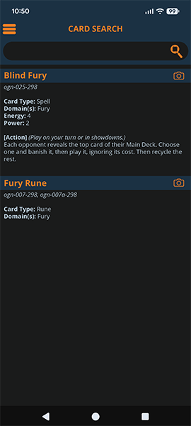 mockup
Outside of navigation and UI, I also developed a set of icons for the hamburger menu on the right side of the page, these help people identify menu items at a glance.
.jpg) old sidebaru
old sidebaru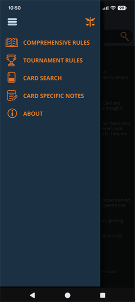 new sidebar
Finally, I also designed an image for the app store. The one the programmer made was, uhm.. Certainly... Unique.
 old app store icon
 new app store icon
Reflection
This was a very collaborative project, and a lot of the work ended up being about adapting ideas to technical constraints rather than just designing in a vacuum.
The strongest parts of this project are the navigation improvements and the visual cohesion. It feels much better to use than a lot of comparable tools, and the interface has enough personality to stand out without getting in the way.
Overall, it’s exciting to see it come together into something functional. It’s the kind of tool I’d actually want to use during an event, which is usually a good sign.