

Concept
This was a logo design for a Star Wars judge program. The main challenge here was pretty straightforward: it needed to feel like Star Wars without actually using any official Star Wars imagery. That's a bit of a tightrope. Star Wars has a very distinct visual language, sharp geometry, strong silhouettes, a kind of "imperial" symmetry. If you miss that, it just looks generic. But if you lean too hard into it, you risk it looking like a knockoff or being legally questionable. The goal was to land somewhere in the middle: recognizable in tone, but still original.
Method
I started by sketching out a few geometric concepts that leaned into that kind of structured, emblematic feel. A lot of Star Wars design is built around bold, symmetrical shapes, so I focused on something that could read clearly at a glance and scale well across different uses. I looked at a lot of star wars imagery and started by basing my initial designs on the holocron since it has a cool design, but is easily riffed on.
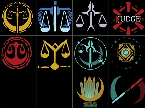 First sketches of the logo
At first they really liked the "Imperial" looking gear so I cleaned that one up and fiddled with some different font options.
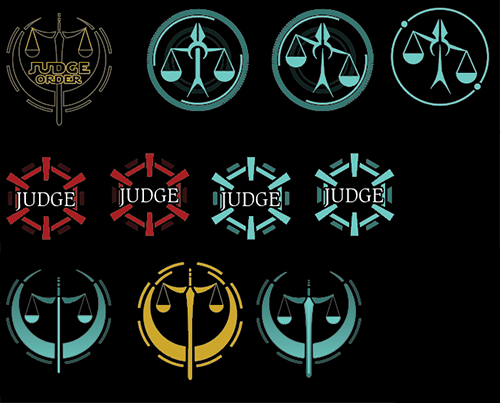 First iterations
After bouncing it around a few people in the company they decided that "Imperial" was maybe not the best look for their organization so I took another crack at sketches using both the Jedi and Sith Holochrons as inspiration.
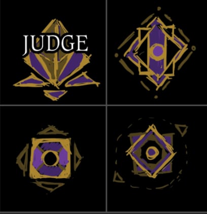 First sketches of the logo
They let me know to iterate on the first and third designs and wanted to see what a cleaned up version might look like
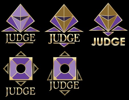 cleaner sketches and interation
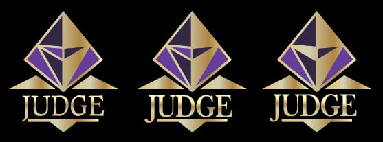
This version uses a strong central diamond shape with angular extensions, giving it that slightly "military insignia" feel. The symmetry does a lot of the heavy lifting here, making the mark feel intentional and authoritative without needing a lot of extra detail. Color-wise, the gold and purple combination was chosen to give it a bit of prestige while still standing apart from anything officially Star Wars. The gold helps sell that elevated, formal tone, while the purple adds some uniqueness so it doesn't just default to the usual black/red/white palette. Typography was kept fairly classic and serifed to reinforce that formal, almost ceremonial vibe.
 More Revisions
A little bit more back and forth and we were done! They also asked for a black and white version, as well as a flat color version and a rainbow one for pride month.
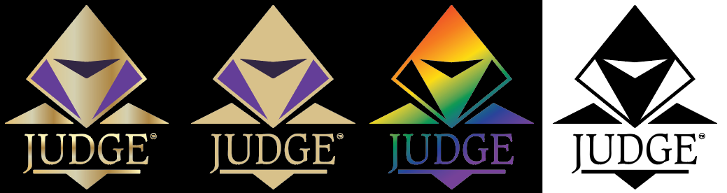 Final logos
Reflection
This was a relatively constrained project compared to some of my others. It was a tough project to straddle the line between "looks like Star Wars" and "isn't actually Star Wars". I have to admit, I liked some of the earlier blue light saber designs more than our end result, but I'm also quite happy with the end result. I think it does what it needs to do. It reads clearly, feels cohesive, and hits that "Star Wars-adjacent" tone without stepping on anything it shouldn't. Unfortunately, while the company handling the SWU Judge program (Cascade Games) was happy with the logo, they were unable to continue with the project, so unfortunately my logo never saw the light of day. That being said, I still had a good time working on it and felt like it was a valuable experience.