 Suit of War
| Suit of Plague
| Suit of Famine
| Suit of Death
Purchase on Etsy
Suit of War
| Suit of Plague
| Suit of Famine
| Suit of Death
Purchase on Etsy

Concept
I was in a little bit of a project lull and decided I wanted to try something new. For a while I'd wanted to make a deck of traditional playing cards. A lot of people ask me what I do for work and when I say I'm an artist that specializes in cards, most people immediately think of playing cards; at which point I have to sheepishly admit that I've never actually made a deck of playing cards and have to explain what a "Triple Triad" or a "Deck of Many Things" is. My first idea was to create a deck of playing cards based around the four conventional elements (air, earth, water, & fire), but saw that this is something that's already been done and done well by others. I instead decided to go for something darker; a set of playing cards themed around the four horsemen of the apocalypse: War, Famine, Death, and Plague.
Method
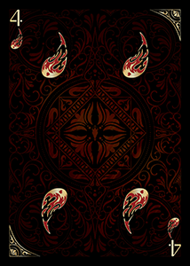
The first hurdle was picking on a general aesthetic. I decided really early on that I wanted a black and gold look with gold ink. I had been expanding my business and wanted to start branching out and trying new printing processes like metallic ink. After figuring that out, the next thing to hammer down was the colors for each suit. These weren't a huge hurdle; Death and War are identified as being associated with green and red in Revelations. Plague and Famine were white and black respectively, which was something I couldn't really adhere to. I decided to make Famine purple, since when Magic: the Gathering wants to represent "black" they tend to veer into purple. And finally I picked blue for Plague, mostly because I needed a fourth distinct color and white just didn't feel right. In traditional playing cards there are two "black" suits and two "red" suits. For this set I decided the delineation could be cool and warm colors. The "black" suits would be blue and green (Death and Plague). Whereas the "red" suits would be Famine and War (purple and red).
 Initial icon for War
For Famine I wanted the main image to be an apple core. Within the core I created the imagery on the left of an emaciated man holding out a dried fruit under a barren tree. On the right side I showed a similarly starved horse and circling vultures arranged to look like a screaming face.
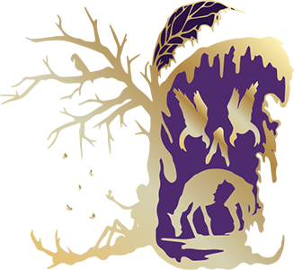 Icon for Famine
Plague was a bit of a weird one for me. Insects are the obvious go-to here, however this is the least "panoramic" of my images. I didn't include nearly as much symbolism as the others. A crossbones design on the abdomen as well as a demonic face on the thorax are really the only icons here. In the future I may redesign this to be more in line with the others.
 Icon for Plague
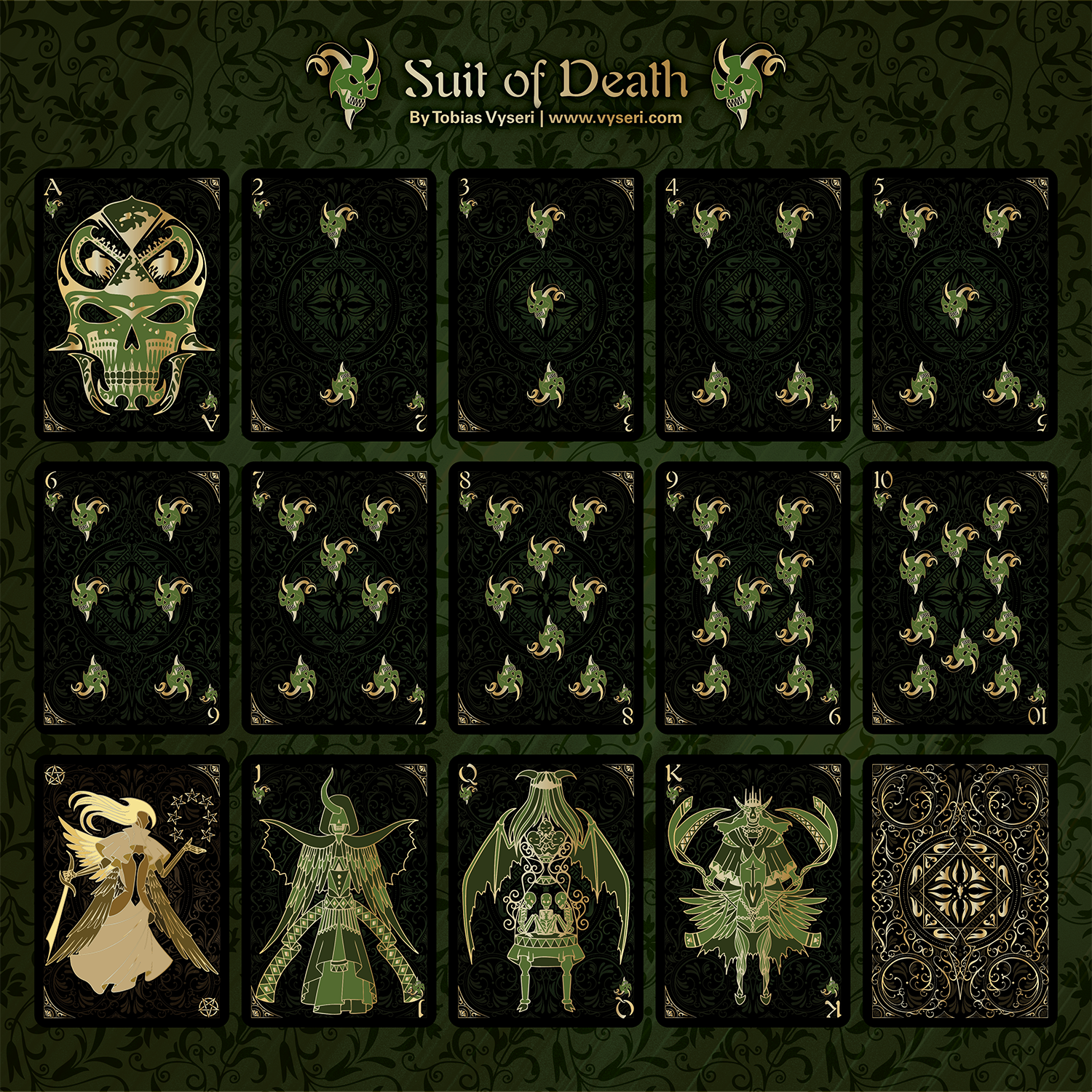
For Death the major motif of a skull was fairly mandatory. The rest of it was a little more challenging since I didn't want to overlap with any of the other motifs, and "Death" in general is pretty vague. I incorporated scythes and imagery of the more traditional western grim reaper. On the back of the scythes are tiny silhouettes of crosses and other gravestones. I also included an hourglass to represent that time will be the ultimate death of everything.
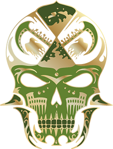 Icon for Death
Unfortunately, these images ended up being far too detailed when shrunk down to typical card icon size, which was something I didn't foresee. I really liked the designs though, so I decided to recycle them for the aces later on.
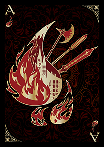 Ace of War
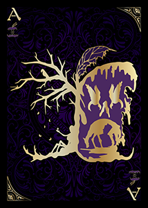 Ace of Famine
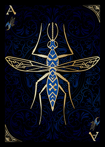 Ace of Plague
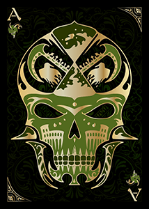 Ace of Death
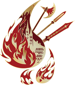
Instead I took a piece of the War image I'd made (the small fireball in the bottom right) and decided to take a break from icons and do some layout stuff. I used it as a placeholder for when I made my real icons, but ended up liking it a lot and designed the other three icons with that as a bit of a base. The icon for Famine didn't take long, an apple core with seeds as a face seemed simple enough. Until very late in design I wasn't sure if I was going to use the Plague icon I'd already designed as the small icon since it felt too detailed to be a small icon but too plain to be the Ace. Eventually I decided that the line weight would be too noticeably different if I used it as the small icon so I made a different insect-themed icon for Plague, I decided to have it be curved like the fireball for War since the curvature helped it wrap nicely around the numbers. I also included a "Plague-doctor" mask on this one.
 Final Icon for War
 Final Icon for Famine
 Final Icon for Plague
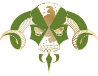
Finally, the icon for Death. It wasn't hard conceptually (a horned skull of some sort), but actually getting it to look right was a challenge. Initially I went for a more symmetrical design like Famine, but after working with the template it became evident that an asymmetrical look would be better.
 Initial Icon for Death
 Final Icon for Death
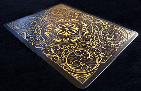
The next major challenge was the card back. By this point I've designed my fair share of card backs and have gradually improved and gotten better at not hating what I've made. Since this was going to be one of my more "mainstream" projects, I wanted this one to feel similar to a regular card back for bicycle playing cards.
I sketched out the image in Photoshop and used Illustrator to trace over my sketch, ensuring that my line weights and circles were perfect. I wanted to have a lot of designs but it ended up looking extremely busy; angular and just somehow really unprofessional. I tried a lot of different things such as making some parts of the image a different color, both to "calm down" the busyness and also to give it some depth. The other thing I tried was taking a bunch of the elements out to give everything some more breathing room.
 Initial cardback
 Cardback with darker portions
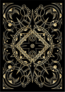 Simplified Cardback
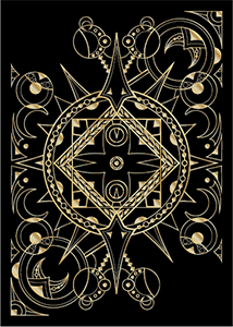 Design for card texture
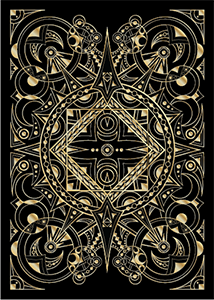
None of these solutions left me with a card back I was particularly happy with, so in the end, very close to the final weeks of the project, I threw my arms up and just drew an entirely different one. My approach this time was slightly different. I made my sketch in Photoshop but then also did the refinement and outline of my linework there as well, only bringing the entire thing into Illustrator and converting it to a vector at the final step. This left me with a much more organic-looking card back with fewer angles, that flowed better overall. I did retain the idea of having some darkened elements of the artwork to help make the design more visually comprehensible. The entire back design is rotationally and mirror symmetric with the exception of the single central horse skull in the middle.
 Final Cardback
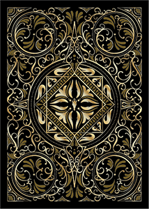
Along with the cardback came the background texture for the cards. I knew I didn't want straight black backgrounds, since I personally favor items with a lot to examine and enjoy visually. So early on I decided to put a faded or subtle version of the card back design on the background of each card. I then used a texture overlay to give the image a little additional depth.
 Card texture
The next challenge was the face cards. I had my aesthetic mostly solidified with the aces, but I had to somehow translate concepts into "characters" rather than scenes. I decided that I wanted the figures to look very demonic and monstrous. Similar to the Suit of Pentacles in my Gothic Horror Tarot Deck. I wanted to include lots of holes in the designs as well as detached limbs and half-formed faces and bodies. I didn't want them to be particularly macabre, but instead more uncanny, something that looks vaguely humanoid but is definitely not. A major inspiration was Peter Mohrbacher's Angelarium project; I really like what he did with that and wanted to incorporate some of his concepts here.
Jack of Famine - For the Jack of Famine I decided to depict him as overweight, but with a large hole in his stomach and heart. I used cutlery and food as the motifs here, as well as the iconic apple core.
Jack of War - I utilized triangles, flames, and horns in the image. I wanted to really convey a pointed vicious creature. The detached hands represent how war is often not fought by its instigators, but the hands of those individuals. The hole in the chest shows us the heartlessness and cruelty of war.
Jack of Plague - Because of the Covid-19 situation, plagues and infectious diseases are something that's at the forefront of many peoples' minds. I remembered my old biology classes and shaped this guy like a bacteriophage. I wreathed the head in a diamond-shaped halo to retain the iconic bacteriophage shape, but within gave the jack a head that is reminiscent of the shape of Covid-19.
Jack of Death - This was a weird one to realize. I went for something that looked kind of like a fallen angel, with a skeletal face and a single asymmetric horn.
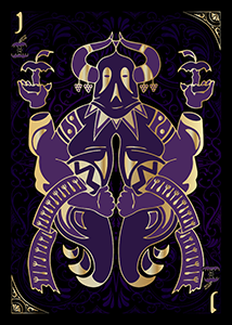 Jack of Famine
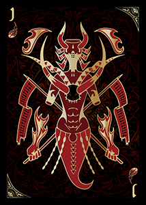 Jack of War
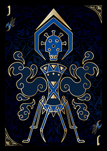 Jack of Plague
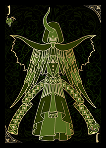 Jack of Death
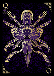
The queens were the next challenge. I knew I wanted them all to be distinctly feminine, but still monstrous. I also knew that they all needed to have some kind of crown. While the jacks utilized a lot of triangles in their imagery I wanted circles to be a main motif of the queens.
Queen of Famine - I had an emaciated woman with her mouth sewn shut. In her arms are cornucopias of fresh food. A knife and fork splay out behind her, tools for consumption in which she cannot partake.
Queen of War - I went with a vicious looking woman; arrows, knives, and claws adorn her. However I also included some jester or clownish elements; some people engage in war out of duty or necessity, but her motivation is more selfish. I also have to admit I was thinking a little of the Warhammer 40k Harlequins and Magic: the Gathering's guild of Rakdos when I was working on the suit of War.
Queen of Plague - Here I wanted to evoke the idea of a "queen bee". Overall she's got a very insectoid look. Chilling wings of bone stretch out behind her instead of the familiar gossamer ones.
Queen of Death - She's barely even human-looking at all; something in between a creature and an idea, an hourglass containing babies who pass through it, aging and dying. Her goat-like hooves and bat-like wings evoking imagery of devils and demons. Her face is obscured, for who can truly look upon the face of Death?
 Queen of Famine
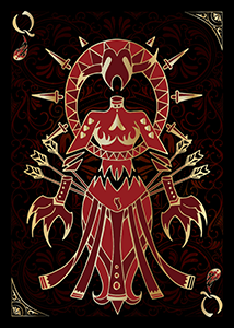 Queen of War
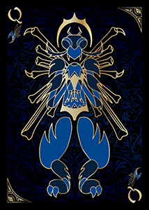 Queen of Plague
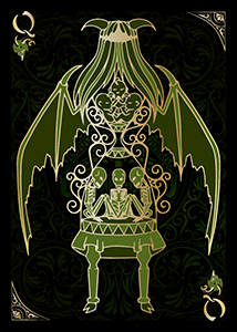 Queen of Death
I wanted to ensure that each king had equine elements. I feel like it would be pretty strange for a "four horsemen" deck to include no horsemen! However I wanted to avoid them all simply riding horses or being centaurs. Since these were demonic monstrosities I had free reign to incorporate their "horsiness" in whatever way I chose. I also paid special mind to obscure all their vision in some way. The harbingers of the apocalypse cannot see the pain they bring. I also gave them all a triangle marking on their chest. The triangles on the king's chests point down on the two "black" suits and heavenward on the "red" suits.
King of Famine - I gave him a horse head but a human body. In the same way that a "maidmer" is an unsettling and uncanny reversal, so too is the reverse centaur. The body is emaciated and in pieces. The scrollwork behind him depicts rotting food.
King of War - I ended up going for a muscular centaur. Violent, flaming weaponry fans out behind him like a crude mockery of wings.
King of Plague - Once again for Plague I went with someone looking particularly insectoid. The equine elements here are the skull pauldrons on his shoulders. He also has a diamond-shaped head, as a nod to the jack.
King of Death - I decided to have him be the only one actually riding his horse. Once again I incorporated feathered wings as well as the iconic "grim reaper" scythe. The sinew is visible on the horse as if it was rotting away as it walked, and its heart is chained. I also included a cross-shaped icon on the horses helmet, to both remind the viewer of gravestones and Roman torture devices.
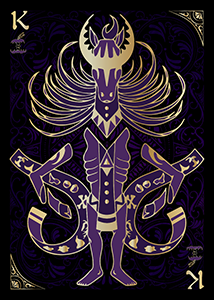 King of Famine
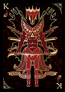 King of War
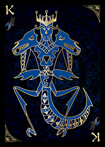 King of Plague
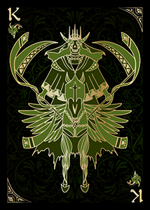 King of Death
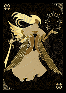
The last unique card I wanted to talk about here was the joker. I knew I wanted to include two jokers but wasn't sure what kind of approach to take. The first thing I figured out was the color scheme, I knew right off the bat it was either brown, yellow or white, as these were all colors I hadn't used yet. White was out of the question since the gold outline would look kind of bad enclosing white space. So I settled on brown & yellow. After looking over Revelations a bit more I decided I wanted my joker to be a kind of "God" or "Christ" looking figure. From there it came together easily. The sword he's holding is a reference to the sword that comes from Christs mouth in Revelations 19:15. While the seven stars represent the seven seals in Revelation 6:1-17. I wanted a "cut out" element like the others to again ensure that he didn't feel too human, so I gave him a heart-shaped hole in his chest. I covered his face and gave him angelic wings. To distinguish him further his design is completely asymmetric, while all the other character cards only sport the odd asymmetric element.
The next hurdle was the "suit symbol". A "J" didn't feel right as the jacks were marked with a "J". I saw that other playing card decks often spelled out the word "Joker". Not only did this eat up a ton of my valuable space, but God isn't really a joker, and it felt out of place with the rest of the deck. I did see a few decks using a star icon and decided that the pentacle would aesthetically mesh with the rest of the design, because while much of the imagery is derived from christian theology, I think the monsters really feel more pagan and otherworldly than biblical.
 Joker
Joker
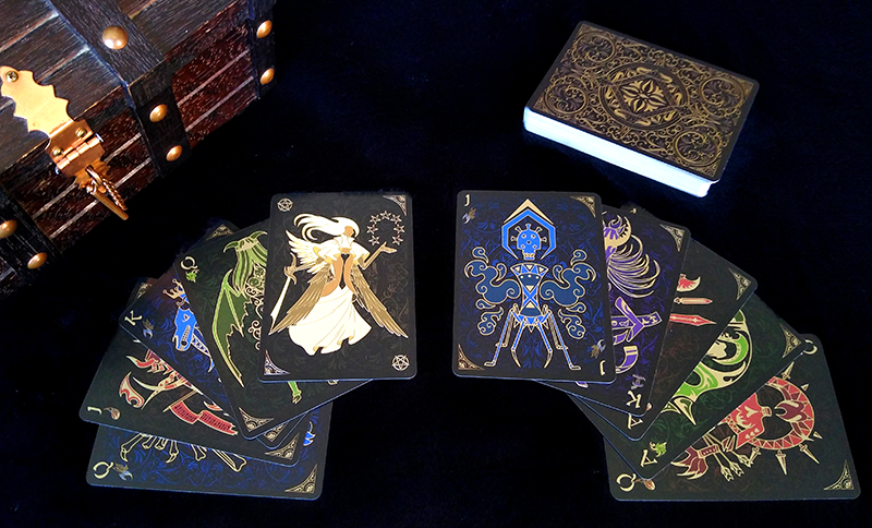
Finally came actually pushing this through production and putting together a box. Since this was not only a completely original project, but also something totally untested, I was wary of ordering such a large quantity. Even more than that, springing for the gold ink already made the project a bit of a financial risk. While having gold ink on the box would've been best, I felt like I just couldn't justify the additional cost on the first print run. Instead I ensured that the cards themselves were as gorgeous and as beautiful as I wanted them to be. The gold ink is truly stunning on the cards themselves and the linen texture makes shuffling them a joy. However when I went to put it all together I realized that my current printer couldn't actually print in gold! I searched around and had to completely switch printing companies to actually realize this project.
 Linen texture & gold ink
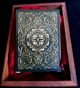 Card box Front
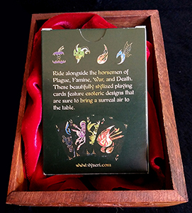 Card box back
Reflection
I had a really great time working on this project, I finished it up right around the same time as Lucent. Drawing the uncanny monsters and figuring out the best way to convey some weird concepts visually was a blast. I'm extremely happy with the card back and think it's one of my best to date! The gold ink gives the project a really nice feeling of prestige and I just can't get over how nice they look and feel. I'm so excited to present this project to everyone, and if it does well enough for me to justify a re-order I'll definitely be looking into getting that gold ink onto the box as well, maybe even a little spot UV!
I'm also really glad I ended up switching printing companies. The prices are much lower and I have a ton of different options to choose from, such as spot UV, linen texture, foil ink, gold stamping and all sorts of exciting things that I've been playing with recently!
Suit of War
| Suit of Plague
| Suit of Famine
| Suit of Death
Purchase on Etsy