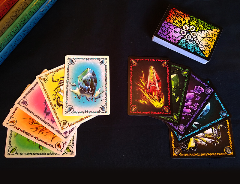
 Classic Theme | Night Theme | Cosmic Theme | Bestiary Theme | Traditional Playing Cards
Instruction Booklet | Play it on Tabletop Simulator
Purchase on Etsy
Concept
So as we all know Covid-19 happened in March of 2020. I was working on the MagicFest Circuit almost full time at that point and all of a sudden instead of looking at a 6 week road trip around the US I was now looking at an indefinite amount of time trapped in my apartment. After finishing up all the immediate projects on my pile, I found that I had a lot more free time. I decided to look a little deeper in my pile and see what was there. About two years ago one of my colleagues, Jonah Kellman, played a prototype of this game with me and asked if I could do the artwork for it. At the time I was working full time and already buried in the dragon commission, so I said I'd let him know when I had time to work on it. Well, I now had time, so I sat down and began drawing. After completing about 3 of the gems I knew it was going to be an enjoyable project, so I reached out to Jonah and began discussing the details.
Method
The first part of the project was simple, just draw elemental gems. I putzed around for a bit but decided on a my "comic-book" style since I hadn't done anything in that style in a while and it's a quick and easy style to draw in. I first put together the five initial gem drawings.
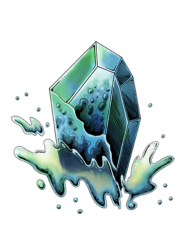 Water Gem
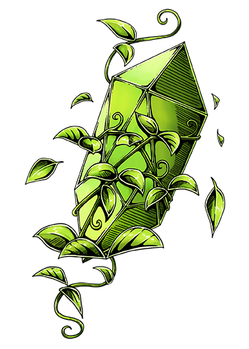 Nature Gem
I presented them to Jonah and asked what he thought. He liked the designs but suggested that we give each gem a custom border and also suggested I try a "dark" theme. He also suggested that I make the "light theme" a little lighter.
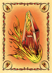 Initial Design
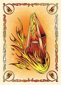 Light-er Theme
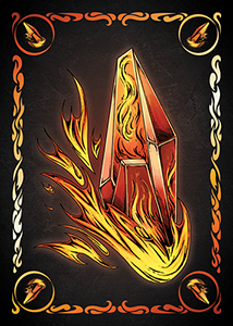 Dark Theme
Something else important that I noted was that because of how the game played it would be pretty important to have some kind of small symbol in each corner of the cards to help with board clarity. I initially tried scaling down the images of the gems but because of the high detail the scaled down versions just looked like messy blobs. To fix the issue I drew simpler versions of each gem for the corner of the card.
 Simple Nature
 Simple Fire
After getting the actual designs well underway we discussed how to market and sell the project. Jonah had launched a Kickstarter campaign before, and I liked the idea of trying Kickstarter since I felt like the "barrier to purchase" was much lower than if people had to ask us for the product directly or go through a place like Etsy or Ebay. I also just thought it would be fun to try, and would be a good learning experience for me if I ever wanted to do one on my own. I had fun making little banners and card fans for the kickstarter. We set our "funded" goal quite low, at $500, since we were effectively done with the project at that point; we just wanted to give our colleagues an easy way to pre-order (and also wanted to save a bit on a batch order of product). We talked about backer tiers and offered tiers where people could purchase both the light and dark versions, since he liked the dark version better, but I liked the light one better, so we decided to just release both. We also offered a tier for "geomancers", where people could pay to put themselves in the game. This was something I'd seen other kickstarters and thought might be fun. We also set some stretch goals; we didn't really think it would go very far so we gave the stretch goals of adding a "wildcard" as well as another aesthetic theme.
So uhm, the Kickstarter exploded. We were funded within a day and demolished all the stretch goals within a week. We even had a few Geomancers! I got to work on a wildcard which we agreed would be based on Bismuth. While we were workshopping names we both wanted to incorporate bismuth somehow due to the fact that the final board layout would be roughly pyramid shaped and was comprised of multicoloured crystals.
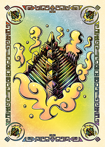 Light Bismuth
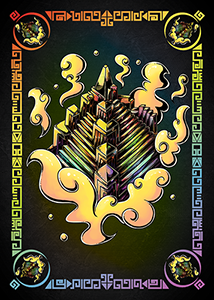 Dark Bismuth
Basically the entire month the Kickstarter was running I was playing catch up. We were blasting past stretch goals faster than I could complete them and it was a scramble to keep it all together. We ended up adding two more themes, which were voted on by backers: a "cosmic" theme and a "bestiary" theme. We also ended up doing a deck of traditional playing cards with Lucent art.
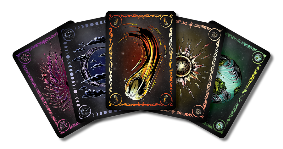 Cosmic Theme
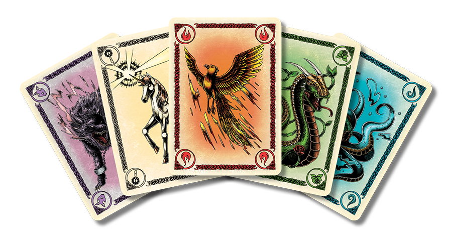 Bestiary Theme
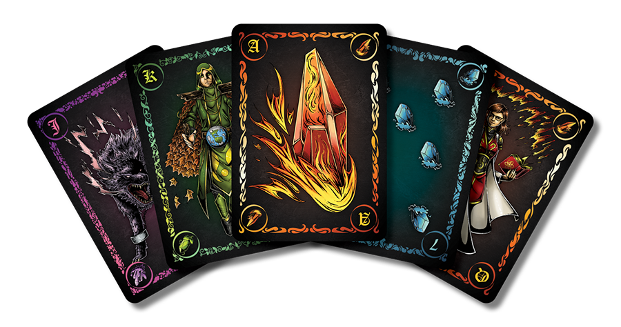 Traditional Playing Cards
I was also working hard on Geomancers. I was really nervous about drawing real people since faces have always been a bit of a weakness for me, but I think I was able to do a really good job on these ones. In the end we finished with 10 paid geomancers, and then another five were put together. My two favorite individual ones were Skarlet and Ian. Skarlet I kind of got to go all victorian gothic nuts on, and red, gold, and black is just a color scheme that looks nice to me. I really enjoyed Ian because of the cool "flame cape" I got to give him and the inclusion of blue makes him feel kind of like a superhero. In the end he came out looking kind of like Doctor Strange, which is always a plus in my books. Finally I was really pleased with my self portrait because I've always found it difficult to actually do these, so when they end up sactually looking nice it's somewhat of a miracle!
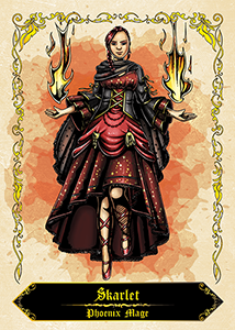 Skarlet
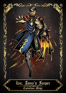 Ian
Ian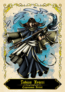 Myself
Reflection
Overall the project was really exciting! It was really cool to see people excited and interacting with the project as it developed. Having someone else manage the boring bits of the project was also really nice. Not having to worry about rules and instructions and the campaign was a big relief! I did learn that doing a Kickstarter was a lot more work than I thought it was, though.
.jpg) Classic Theme | Night Theme | Cosmic Theme | Bestiary Theme | Traditional Playing Cards
Instruction Booklet | Play it on Tabletop Simulator
Purchase on Etsy
Classic Theme | Night Theme | Cosmic Theme | Bestiary Theme | Traditional Playing Cards
Instruction Booklet | Play it on Tabletop Simulator
Purchase on Etsy