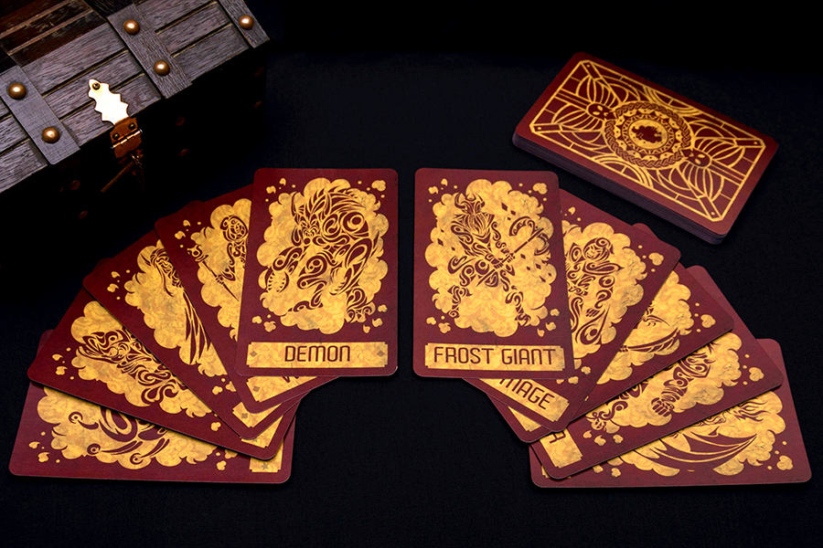
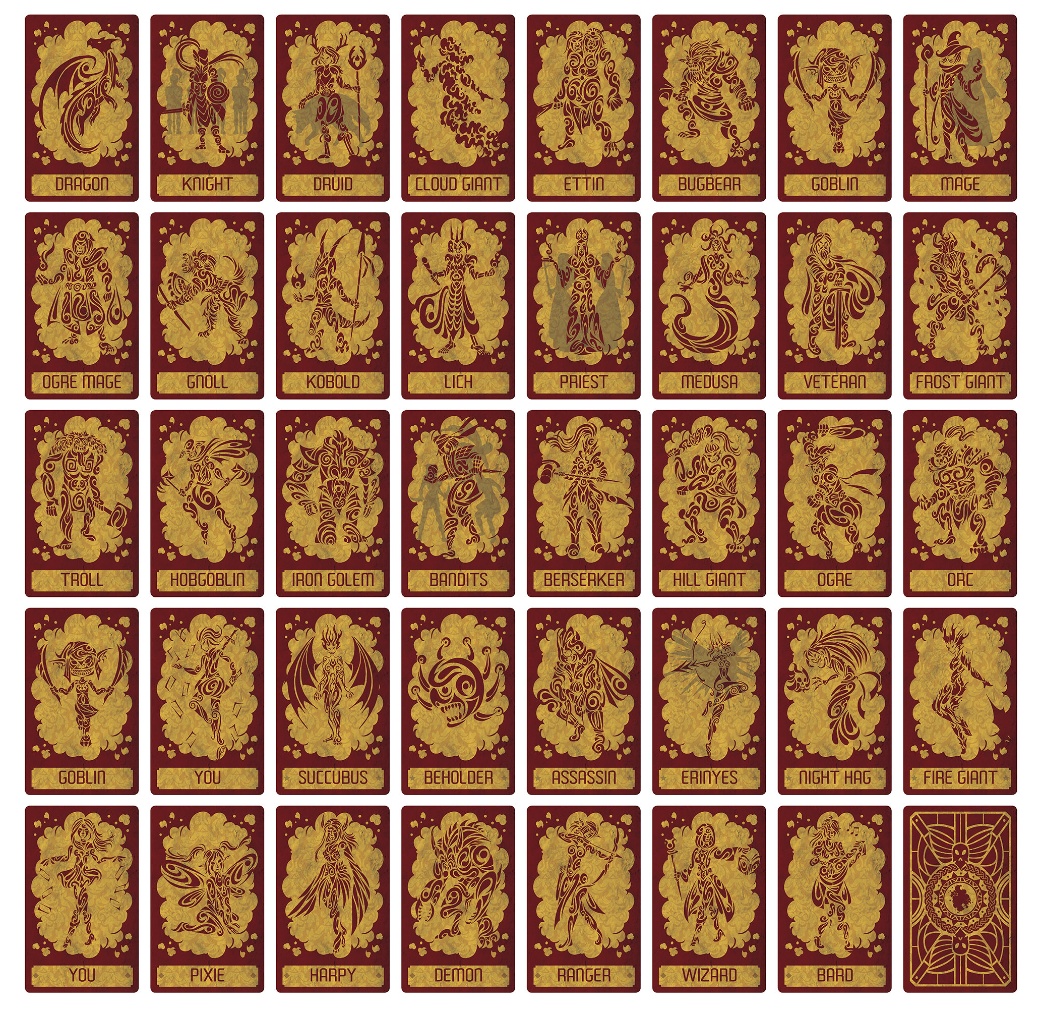
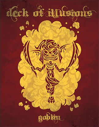
 Full Deck
Purchase on Etsy
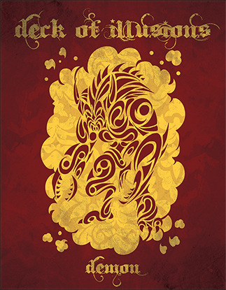
Full Deck
Purchase on Etsy

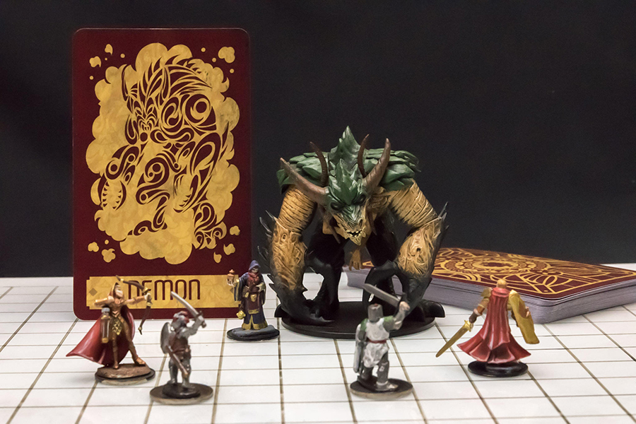
Concept
This project started out kind of strangely. My Deck of Many Things became immensely popular after it was featured in a prominent stream, and subsequently a plethora of people asked me about other Dungeons & Dragons products. Notably, a Deck of Illusions. At first I wasn't too keen on the idea, since I was in the middle of a few other projects and didn't really know how many people would actually be interested in a Deck of Illusions. However after I finished everything on my plate, I decided that it would be a nice light project to pursue.
Method
In contrast to many of my other projects, I had an idea of the aesthetic at the outset. I wanted it to be similar to the Deck of Many Things so they felt like a set. However, the clean, simple iconography of the Deck of Many Things wouldn't really work for this project. The complicated concepts I needed to convey in the Deck of Many Things, like losing a level or changing alignment, were best shown through a combination of different symbols. And since each symbol was very simple, having many of them on a single card didn't end up making the overall image cluttered. Conversely, the Deck of Illusions isn't trying to get across a concept, rather it's trying to show the viewer something much more straight forward and concrete, a specific monster, race or class. I felt like if I just created a bunch of silhouettes of rangers, demons and harpies not only would the cards be quite plain and boring, but that each image would start to get really samey. I played around with some different ideas, but in the end I decided to go with a kind of 'tattoo style' imagery. I felt like this would offer me an avenue for detail but would still allow me to work within the tri-chromatic color scheme.
 Orc Mage Image before effects
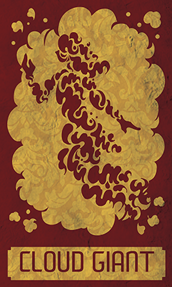
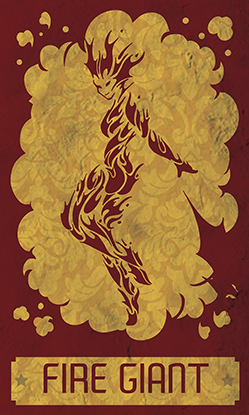
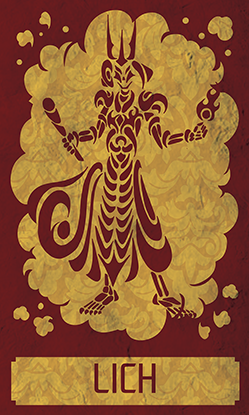
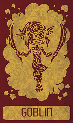
Each creature was drawn and then inked on paper before being scanned in and converted to a vector in illustrator. With some of the images I changed the internal shape designs to convey a texture. With the cloud giant I had little cloud designs, and with the fire giant I tried to make her look like she was made of little flames. For the lich I used thick cylindrical shapes to give the impression of bones, and for the Goblin I stayed away from the smoother swirls evident in some of the other pieces to give him a more pointy, cobbled-together look.
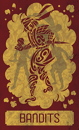
Another challenge was what to do for the cards that gained you more than one illusion, such as the Archmage & Apprentice card, or the Priest & 2 Acolytes card. I tried a few different options, but settled on a faded silhouette featuring the extra guys included with your spell. I'm not thrilled with this as a solution, but I couldn't find another idea that I liked better.
 Archmage & Apprentice
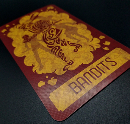
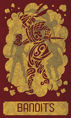 Bandit Captain & 3 Bandits
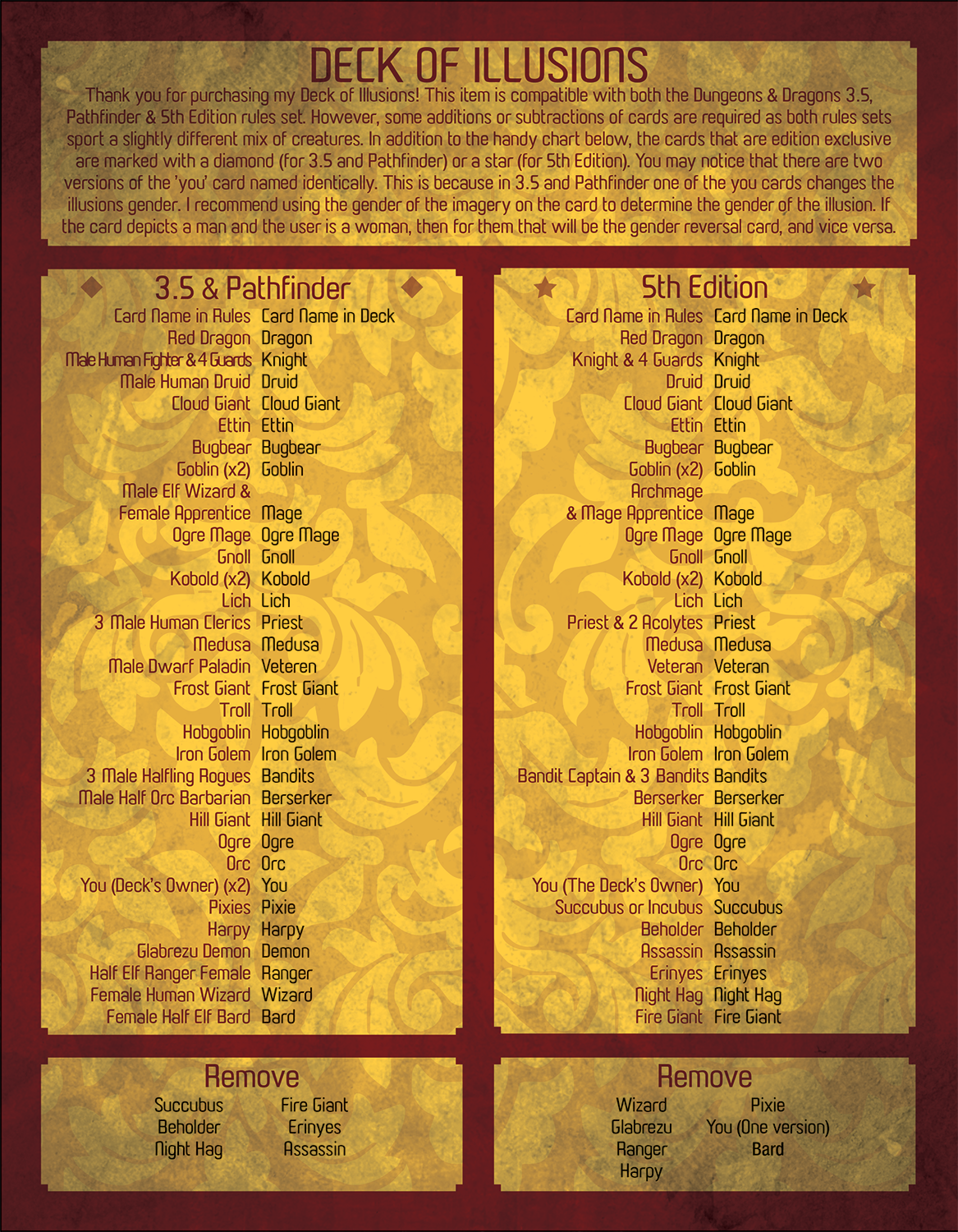
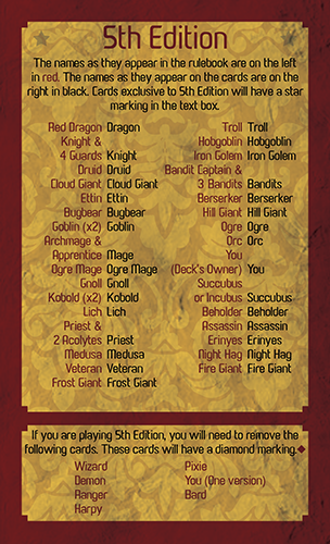
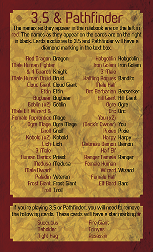
Another issue that came up was the problem of version-specific functionality, the Deck of Many Things has kind of remained constant since its conception, and in basically every version of Dungeons & Dragons, it contains the same 22 cards. Unfortunately the Deck of Illusions is not so concrete; Pathfinder and 3.5 feature a 33-card deck while 5th Edition has a 32-card one. My immediate solution was to simply include the extra card (similar to how I included a blank card in the Deck of Many Things) but Pathfinder and 5th edition also seem to disagree on several of the other core cards as well.
I thought about simply catering to the most recent edition of Dungeons & Dragons, and releasing a deck only 5th Edition could play. However I didn't really like this solution, partially because I only realized the version disparity after many of the images were done, but also because a few of the cooler cards were only in 3.5 and Pathfinder, such as the pixie, the demon, and the harpy. The other problem was that I was still operating under the assumption that I would need to put any rules text on a single card (like with the Deck of Many Things) and my printing company either did batches of 32 cards or 40 cards. I dithered for a while but in the end decided to do the 40 cards. Hoping that I could include all the cards that both versions required, giving the player the option to remove cards to customize the item to their version. I found many analogues between the two versions; for example, 3 Male Human Clerics (3.5) was not dissimilar to a Priest & 2 Acolytes (5th) and could both be shuffled under the Priest card.
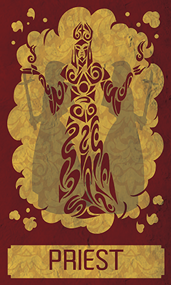 Priest & 2 Acolytes (5th) or 3 Male Human Clerics (3.5 & Pathfinder)
Finding cards that could be used across both versions was also made a little easier because of the fact that I decided to stick with simple one-word names, akin to the Deck of Many Things. Rather than be super specific, I figured a one-word name would be good enough to get the idea across with the players able to reference the rules for the exact specifications of the illusion. However, this aggressive analogue-hunting resulted in a few more stretched definitions since by this time most of the artwork was already completed. (I tend to follow a solid methodology on most projects of 'make stuff first, ask questions later'). For example, 3.5's Male Dwarf Paladin ended up being classified as 5th edition's Veteran. This worked OK because the piece I had drawn ended up looking dwarfish enough. Though the concept was an aged human fighter.
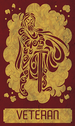 Veteran (5th) or Male Dwarf Paladin (3.5 & Pathfinder)
However I think the worst offender is 3.5's Male Half Orc Barbarian being classified as 5th edition's Berserker. If the art is examined closely, it will be pretty evident that the creature drawn is not an orc at all, but in fact a lizard woman. This is because I created the Berserker art fairly late in the project, and at that point I was exhausting my creative stock for big dudes in armor. The veteran, the ogre, the hill giant, the orc, and the knight all looked pretty similar. I wanted each card to be unique, so I decided to go with a lizard-person. Then afterwards I was organizing my conversion chart to make sure I hadn't missed anything and realized I'd made a mistake. I thought about changing it, but decided that the discrepancy was minor and that the diversity it added to the deck was worth the slight inaccuracy.
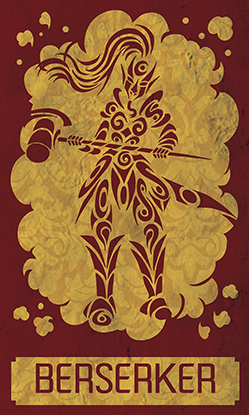 Berserker (5th) or Male Half Orc Barbarian (3.5 & Pathfinder)
I also included a faded star or diamond in the text boxes of the version-specific cards to make additions or removals easier, just in case someone shuffled the deck up.
 Star design for 5th Edition
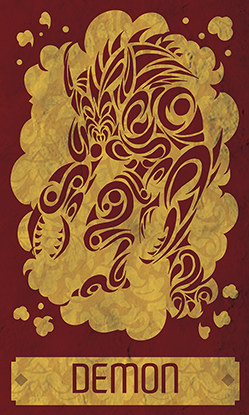 Diamond design fo 3.5 & Pathfinder
Finally after organizing my versions I realized I had exactly 40 cards. This meant that I wasn't going to be able to include the rules on their own card, since the print run was exactly 40 cards; otherwise I'd end up in a different pricing bracket. I decided to address this problem in the same way that I addressed the issues with Pokemon Swap, by inserting a 'rules sheet'.
 Rules Insert
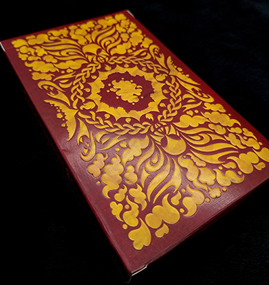
The rules insert ended up taking only a single page, so on the back I decided to put a large piece of artwork, akin to a poster, rather than leave it blank. I had a hard time deciding on what pieces I liked best from the set, so I picked out four and decided that the posters would be randomized. (Things are more fun when they're randomized!)
However, it sold well enough to warrant a larger print run. I work with two main printing companies: a small one for experimental projects, where I'll order like 50 of a thing and see how it does, and a large-run printer which does minimum orders of 500. I began speaking to them about a larger print run and it turns out their sheet sizes are different! I decided to include the instructions on a single card for the new print run of the project.
Another thing I did for the new print run was redesign the card back. The old card back was very blocky and I didn't think it really matched the card fronts, so I went for a more cloudy look, while keeping the same basic design.
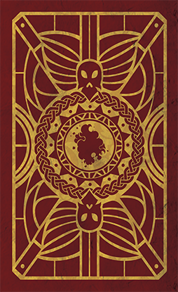 Old Cardback
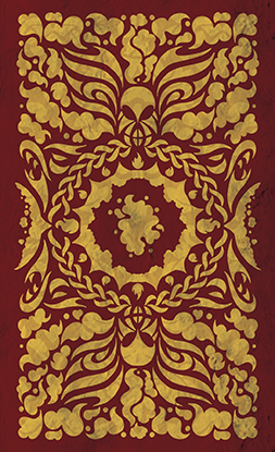 New Cardback
The Decks of Illusions continued to do well online, so not only did I order a bulk order, but I also ordered a foil version. To spice things up I made the shadowy figures in the background of the Deck of Illusions white for the foil version instead of grey.
 Non-Foil Design
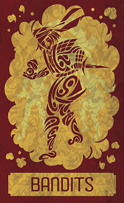 Foil Design
Overall I think the foiling came out nice.
 Non-Foil
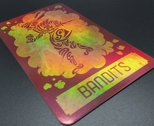 Foil
Foil
A lesson I learned from the foil Decks of Many Things was that it's really important to have the outside of the box labelled clearly, so that it's easy to tell which is foil and which isn't. For the Decks of Illusions, I also changed the "flair" on the box for each version too; the foils have spot UV but the nonfoils are embossed.
 Non-Foil
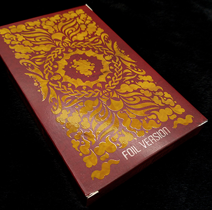 Foil
Foil
Reflection
Overall I'm pretty happy with how it came out. I was very uneasy about doing the project because I was worried I wouldn't learn anything and that there wouldn't be any real challenges, but I felt like I did get to explore some new territory here! I'm also really happy with how well it's been received; for a rather obscure item from D&D I've had decent success with it online. I also had a lot of fun trying out embossing and spot UV on the boxes!
 Purchase on Etsy